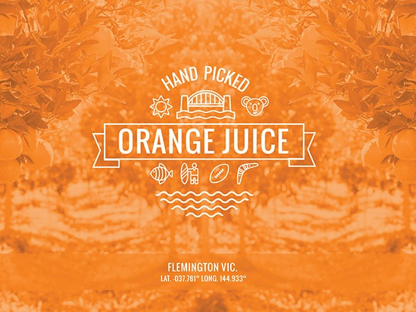
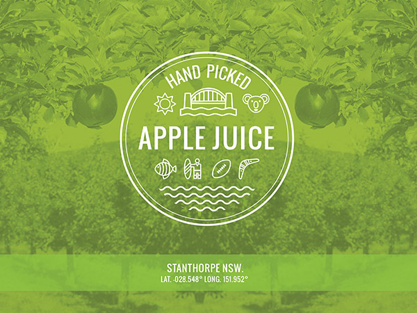
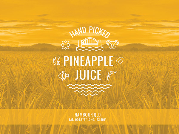
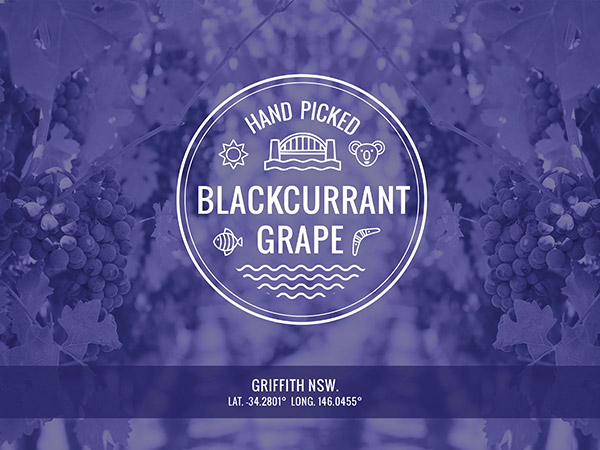
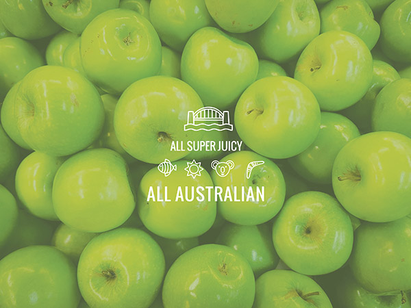
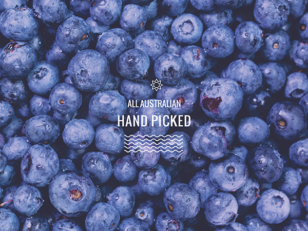
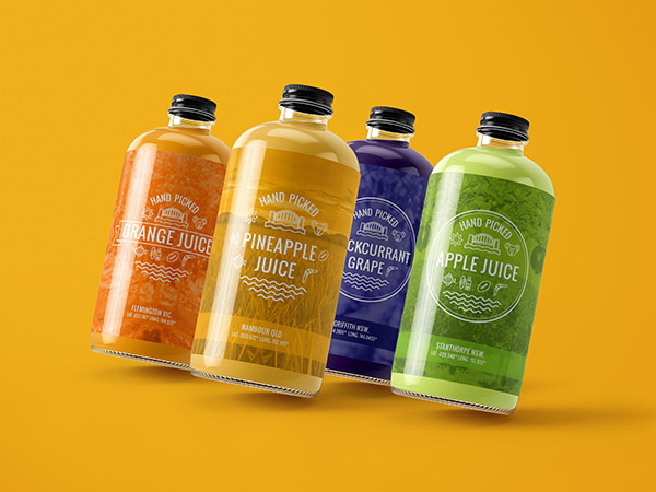
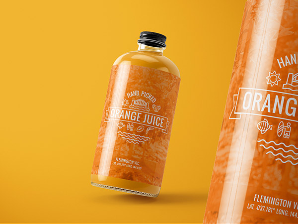
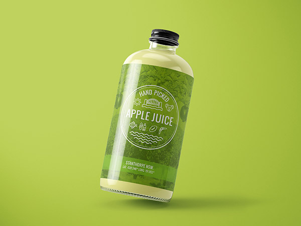
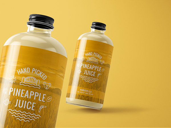
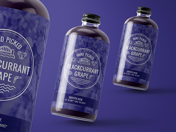
Australian Premium Juice - Juice Packaging Design

Local to the Griffith Riverina area Australian Premium Beverages is an established factory that has resided in the area locally for several generations. In the past the main production has been for bulk wholesale. They were looking to expand into retail products with an Australiana theme. We explored several themes and concepts. Australiana typically is quiet kitsch and for the international market. We wanted one that showcased Australian regions, farms, and local produce. We felt this is appealing to both international and local consumers.


BRAND DESIGN

Many young Australians and visiting back packers are experienced in the adventure of doing a season picking fruit and vegetables. Touring and visiting rural areas for a season and staying in pickers quarters on the farm. It’s a hard life with many challenges (and not that lucrative 😊). To celebrate this movement and way of life, we wanted to highlight the areas with latitude and longitude coordinates. We also wanted to feature how many were hand “picked and squeezed” in the bottle.


Juice Packaging Design, Juice Label Design


Juice Packaging Design, Juice Label Design


Juice Packaging Design, Juice Label Design


Juice Packaging Design, Juice Label Design


Juice Packaging Design, Juice Label Design

Juice Packaging Design, Juice Label Design


Juice Packaging Design, Juice Label Design


Juice Packaging Design, Juice Label Design


Juice Packaging Design, Juice Label Design


Juice Packaging Design, Juice Label Design

Juice Packaging Design, Juice Label Design


Juice Packaging Design, Juice Label Design


Juice Packaging Design, Juice Label Design


Juice Packaging Design, Juice Label Design


Juice Packaging Design, Juice Label Design


WHAT WE CREATED

Frank started with wanting a new logo for Australian Premium Beverages. We then moved onto many concepts including Australian animals, Iconic Australiana locations before going with our final concept. The limitations of this idea is you cant always be 100% on the amount of items that went into the bottle as well as that all the ingredients came from that exact location. we still felt that the concept has strong merit and that a disclaimer would help to explain this to the concumer.


"The team are always just a phone call away and we know that we can rely on them. The success that has come from our newly launched brands has been unfathomable. We are so pleased that the brands have taken so well and we have the utmost confidence to continue down this path with the Gold Coast Graphic Design team by our side."