WHAT WE CREATED
|
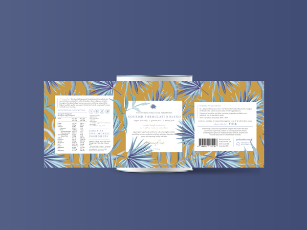
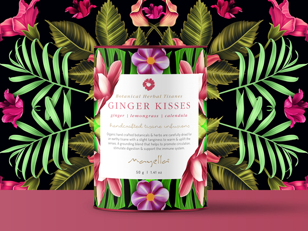
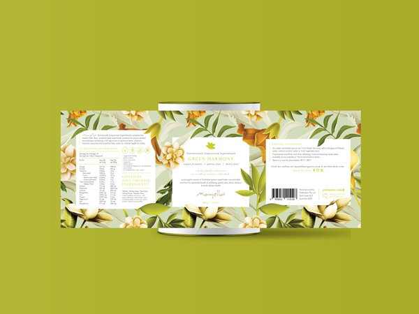
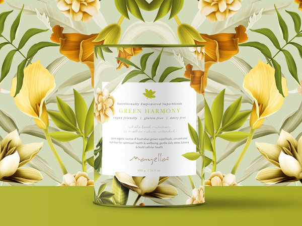
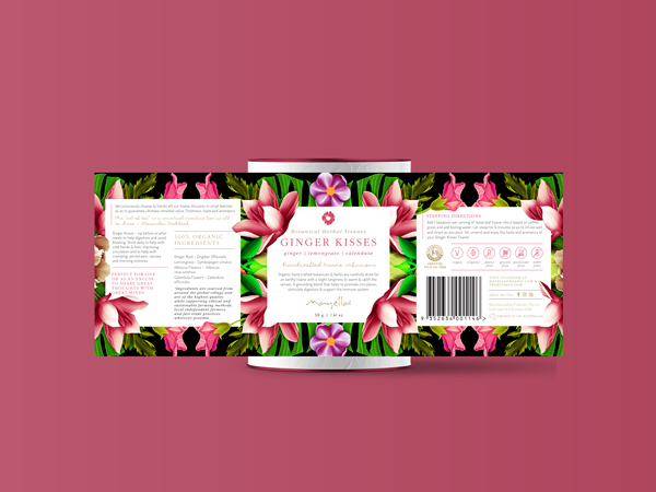
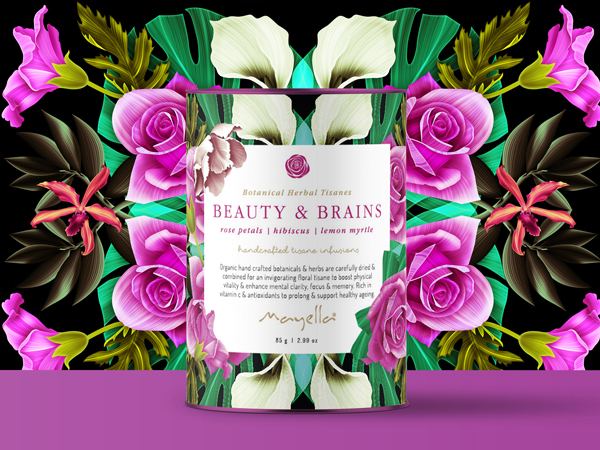
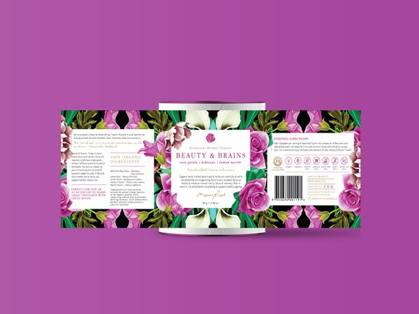
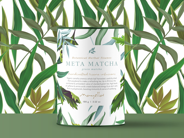
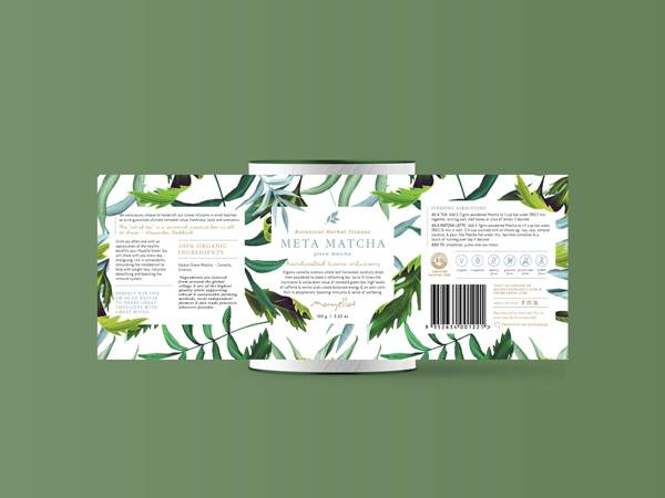
Each of their products had been attributed with a particular background pattern over the years, so we kept these and refreshed the entire design starting with their nutritional blend range. Being a premium product, we kept a very clean but high end look through carefully considered layout and font use, and carried this through to the final product in printing with metallic highlights in their labels. This new look has been carried throughout their tisanes and soon to be skincare, to bring all of their products to a look where they can compete in the modern marketplace.
See more Skincare Packaging Design and Vegan Packaging Design.
|