|
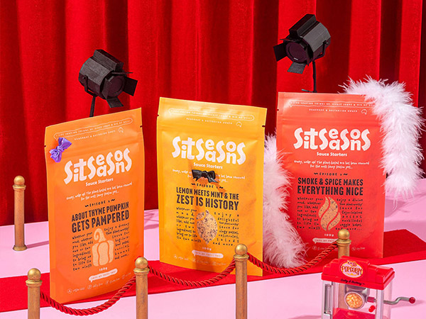
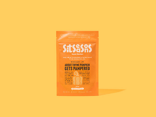
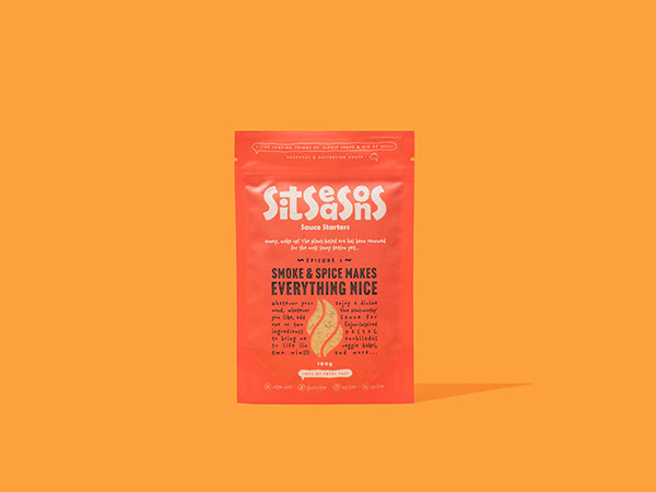
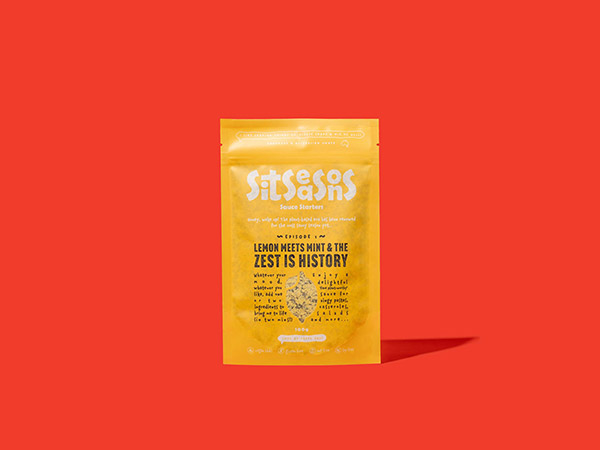
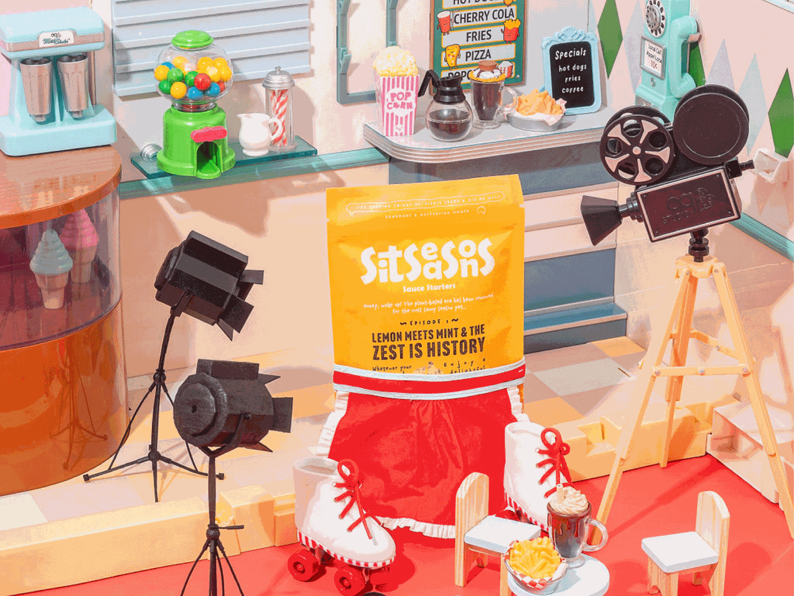
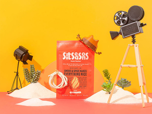
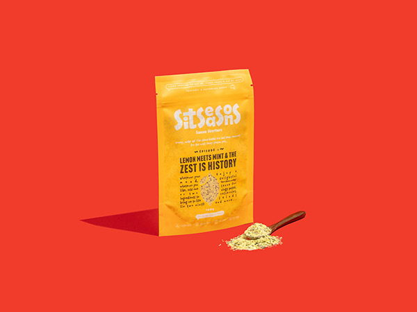
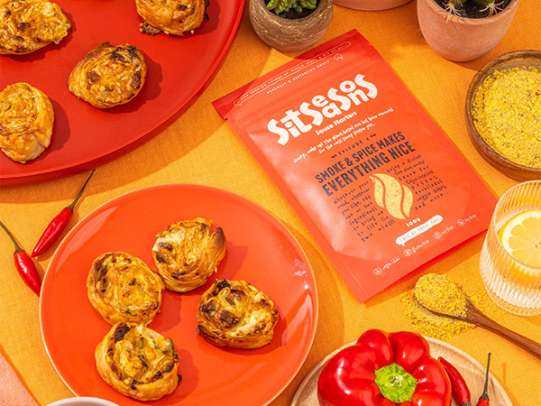
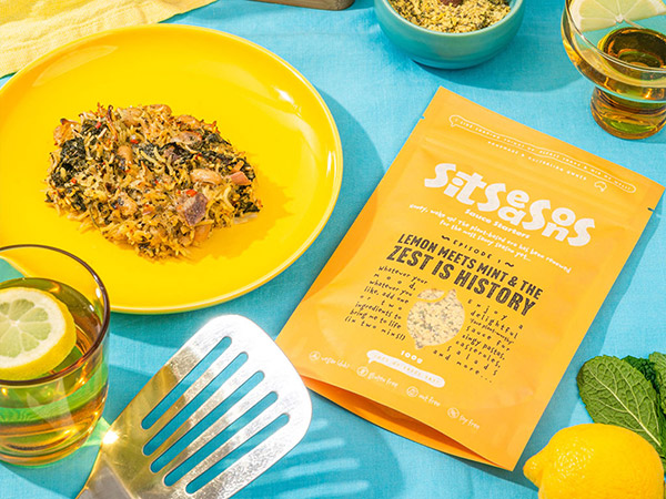
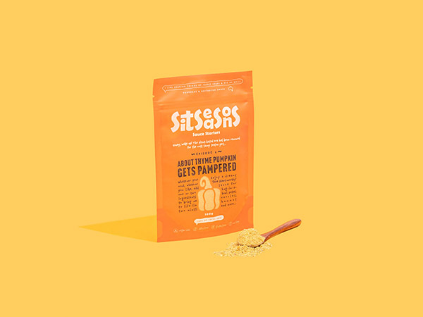
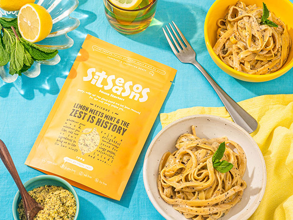
So, our Designer Maria created a playful logo, with texture incorporated on the font represents the spices and seasonings, whereas the 4 big capital "S" represent the four seasons. Each packaging has its own personality:
-Lemon meets mint & the zest is history - yellow, bright, flirty and cheeky.
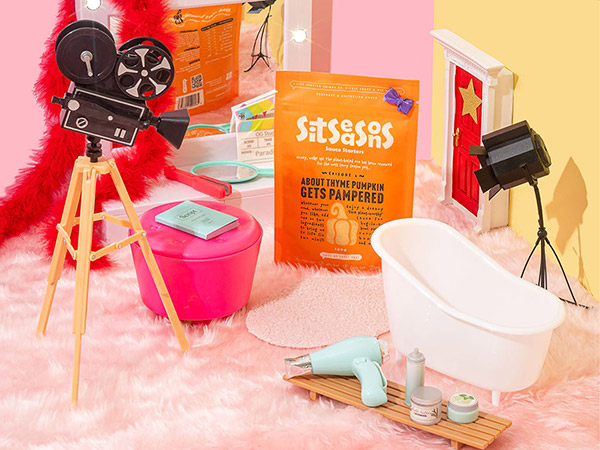
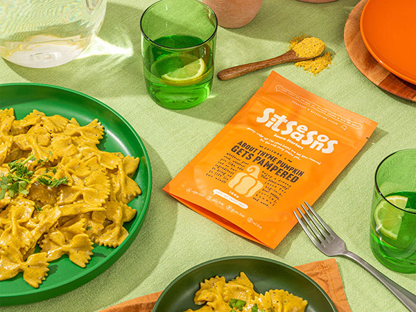
-About thyme pumpkin gets pampered - orange, girly, relaxed and comfy.
-Smoke & spice makes everything nice - red, bold, fiery and spicy.
Our team was thrilled with the design result and how creative Sitara is! Check out their Instagram to learn more about this amazing product. I’m kinda hungry after writing this down, gotta order some Sit Seasons. Excuse-meee. Bye. 😅
See more Seasoning Packaging Design and Spice Packaging Design.
|

