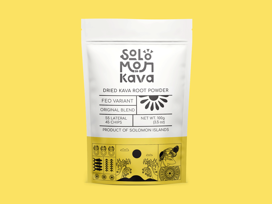
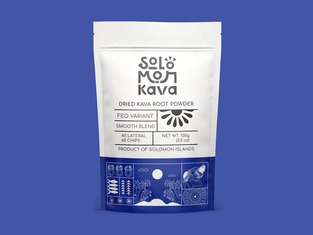
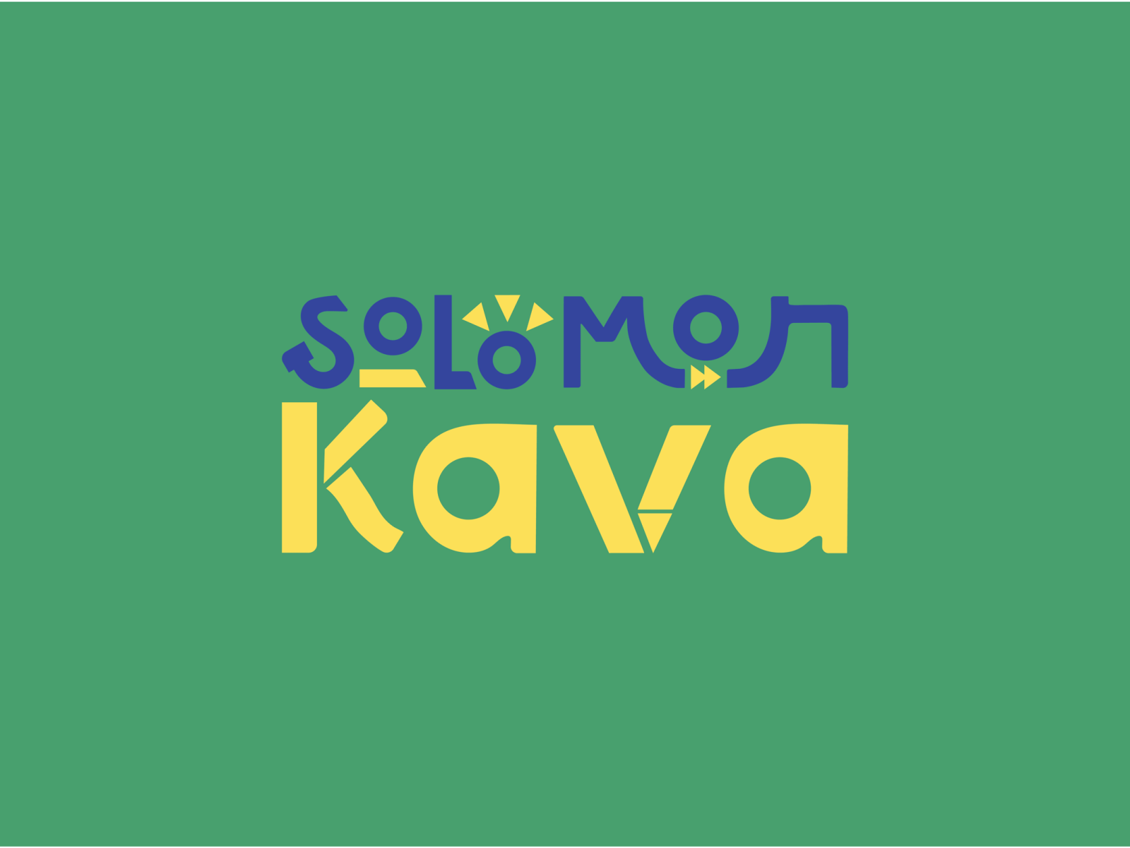
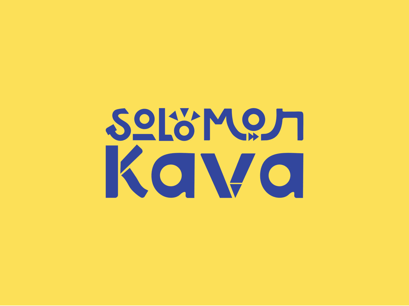
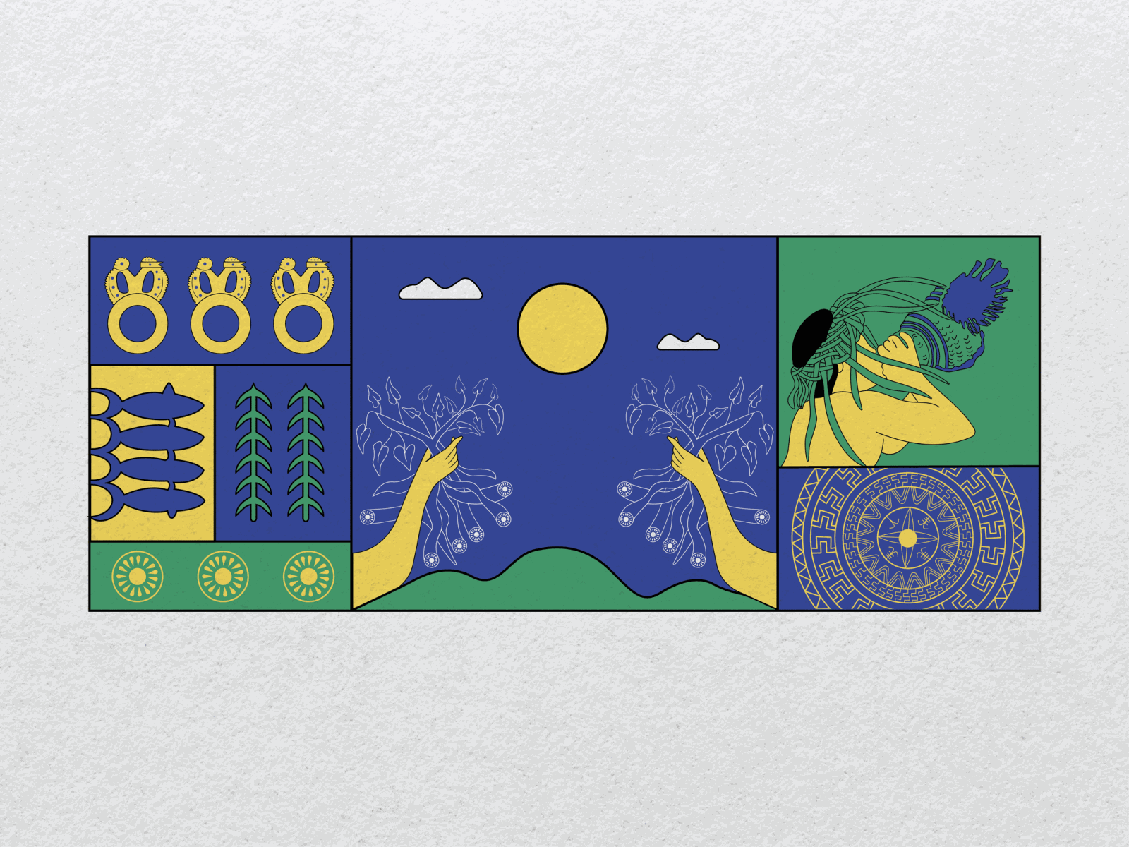
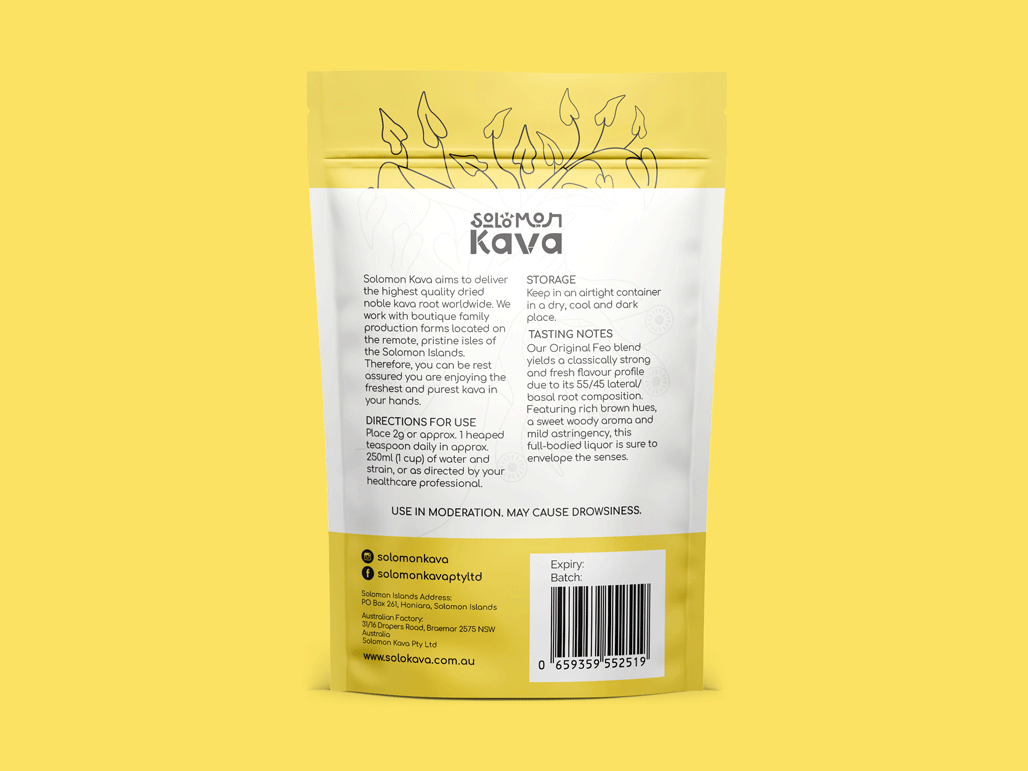
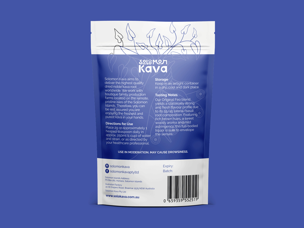
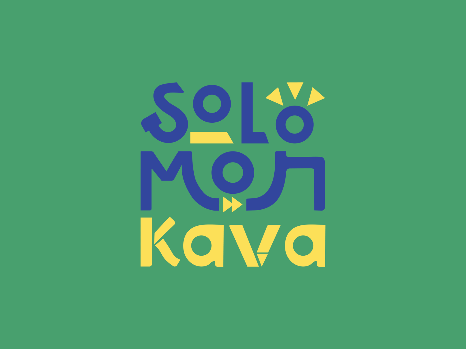
Solomon Kava - Packaging Design

Solomon Kava's brand vision is deeply rooted in the heart of the Solomon Islands' rich cultural tapestry. This brand is committed to authentically representing the unique heritage of the Solomon Islands through their high-quality products. Celebrating the natural and healthful qualities of kava, a revered root in the islands, Solomon Kava not only offers a premium product but also a cultural experience. Each item in their range is a testament to the traditional uses and significance of kava, embodying a deep respect for nature and ancient practices. The brand's dedication to quality and authenticity creates a bridge between the Solomon Islands' culture and the global community, inviting people everywhere to appreciate and partake in this healthy, natural tradition - click to check out the logo design and package design we proudly created for them.


Brand Vision

We are proud to present our latest design project: a logo and packaging design for a premier kava powder brand. This design represents a harmonious blend of contemporary elegance and the rich cultural essence of the Solomon Islands.

The logo is a carefully crafted homage to the heritage of the Solomon Islands, balancing modern design elements with traditional symbols. Central to the logo is the emblematic sun, symbolizing the client's vision and aspirations, intertwined with motifs that reflect the fertile lands and the community's vibrant spirit. This logo is more than a mere emblem; it encapsulates a narrative of vitality, progress, and enduring values.


Kava Package Design, Packaging Design, Kava Packaging Design, Australia Package Design, Trending Package design, Illustration Package design


Kava Package Design, Packaging Design, Kava Packaging Design, Australia Package Design, Trending Package design, Illustration Package design


Kava Package Design, Packaging Design, Kava Packaging Design, Australia Package Design, Trending Package design, Illustration Package design

Kava Package Design, Packaging Design, Kava Packaging Design, Australia Package Design, Trending Package design, Illustration Package design


Kava Package Design, Packaging Design, Kava Packaging Design, Australia Package Design, Trending Package design, Illustration Package design


Kava Package Design, Packaging Design, Kava Packaging Design, Australia Package Design, Trending Package design, Illustration Package design

Kava Package Design, Packaging Design, Kava Packaging Design, Australia Package Design, Trending Package design, Illustration Package design


Kava Package Design, Packaging Design, Kava Packaging Design, Australia Package Design, Trending Package design, Illustration Package design


Kava Package Design, Packaging Design, Kava Packaging Design, Australia Package Design, Trending Package design, Illustration Package design


WHAT WE CREATED

Our design approach was deeply informed by extensive research into the Solomon Islands' rich history and traditions. The packaging illustration highlights the kava root's cultural importance, the life-giving sun, the interconnectedness of people and nature, and the sanctity of age-old ceremonies. As a diverse team, we approached this project with utmost respect and sensitivity towards the cultural nuances.

This project marks a continuing journey in capturing the spirit of the Solomon Islands, and we invite feedback and insights to ensure an authentic and respectful representation of this magnificent culture. We encourage you to share your thoughts and engage with us as we continue to explore and celebrate the rich heritage of the Solomon Islands.


After reviewing a few different graphic design companies, I decided to go with Gold Coast Graphic Design for my upcoming food brand which needed the right balance between modern, eye catching colours and culturally significant themes and motifs. I met with Isac who helped me navigate exactly what the process would entail in order to create the most effective logo and retail packaging design. He was patient, knowledgeable and professional throughout the enquiry stage. When he introduced me to Ju, who was the chief graphic designer for my project, I was beyond impressed. She was always punctual with updates and email responses, absorbed feedback with humility and professionalism, and delivered a product through many renditions requested until our team were satisfied. I can't thank Ju, Isac and the team at Gold Coast Graphic Design enough for all the hard work they have dedicated to our project, and look forward to working with them again for our future packaging design needs.
Kimberley - Solomon Kava