The Logo Briefing Process
When beginning a logo it is crucial for the designer to gain a clear understanding of business needs, goals, and objectives. This is achieved by asking questions that provide insight into a business, target audience, and any specific requirements or preferences of the owner/business. The end goal is to create a logo that effectively communicates the brand identity and resonates with the target audience. Thorough research is an important part of the design process. Also exploring research of industry, competitors, and target audience is incredibly valuable.
To create a logo design that accurately reflects brand identity and appeals to your target audience, designers rely on this Written Brief as well as a Visual Brief. A set of 20 questions below can help guide through the written aspect of the planning. By businesses considering these questions, designers are able to create a detailed plan that ensures a seamless and successful logo design project. Ultimately, this approach helps designers deliver a final product that effectively communicates brand identity, resonates with a target audience, and connects with the owner/team.
The Written Logo Brief
The below steps are a good starting point. Please don't stress, you don't need to answer all of these it is just some topics you may want to explore.
- Your Company Name?
- Would you like to include a catch phrase/tagline with your logo?
- Please describe your products or services:
- Is it a new buisness or existing business? (Is there brand history and important background information)
- Target Market: Who are your customers?
- Target Market: Where are they?
- Target Market: Are your products/services aimed at a particular gender / age / income range / group?
- Target Market: Do you know their demographics, traits, and needs
- Do you already have a logo or identity? If yes, why are you making a change? Do you want to keep it similar looking or change it to something different?
- Would you like a logo symbol? If yes, is there anything specific that you want or do not want? Do you want combined symbolism?
- Do any existing logos appeal to you? (make a collection of logos you like and don’t like, preferably with an explanation)
- Do you have a colour/s preference?
- Do you have any typefaces you would like? (serif, sans serif, full of fun and character, ect.)
- Are you planning to trademark your logo?
- Is there a usage of the logo that is super important to you?
- What are four words that best represent what you stand for (your values)
- Do you have a brand strategy?
- Do you have an established Mission or Vision statement
- Do you know your competition? Overall message they want to convey. How do you differentiate?
- Do you know your competition? - names of companies + images of their current logos as a benchmark
The Visual Logo Brief
Designing is a creative process that is open to people’s interpretation and perspective. As branding specialists we look at logos day in and out, we are dedicated to our profession (never go grocery shopping with us :))
But we are not the people who will be wearing the logo. It is important that not only does it work for the business but that it connects and resonates with you. For this reason you may have likes/dislikes/preferences that we need to understand. The best way for us both to explore the visual side is to see examples that represent what is creatively in your head as words can be interpreted differently (a simple example is what colour Royal Blue means to people, see these versions)
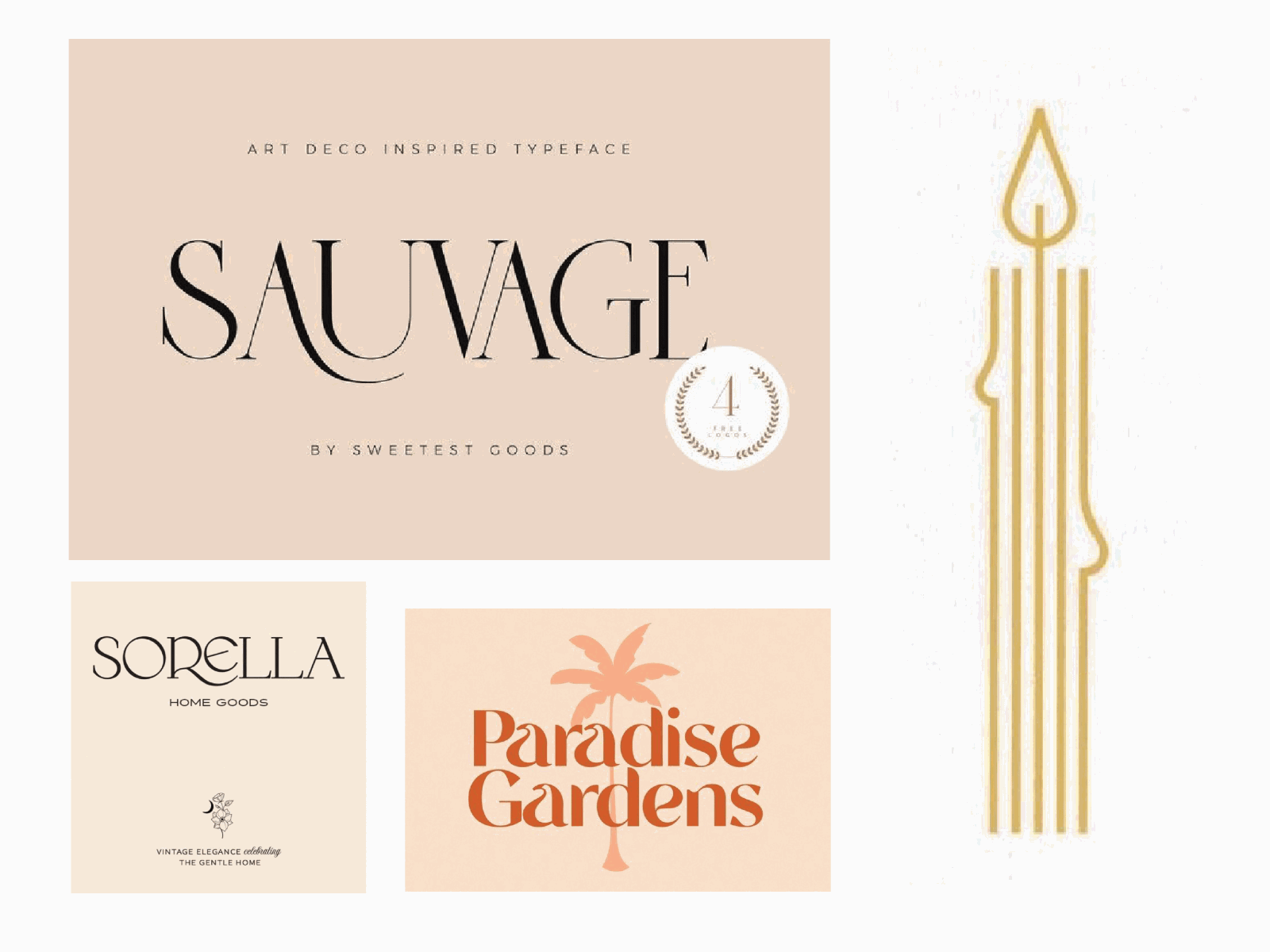
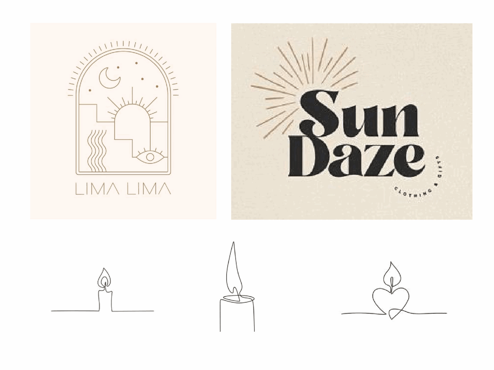
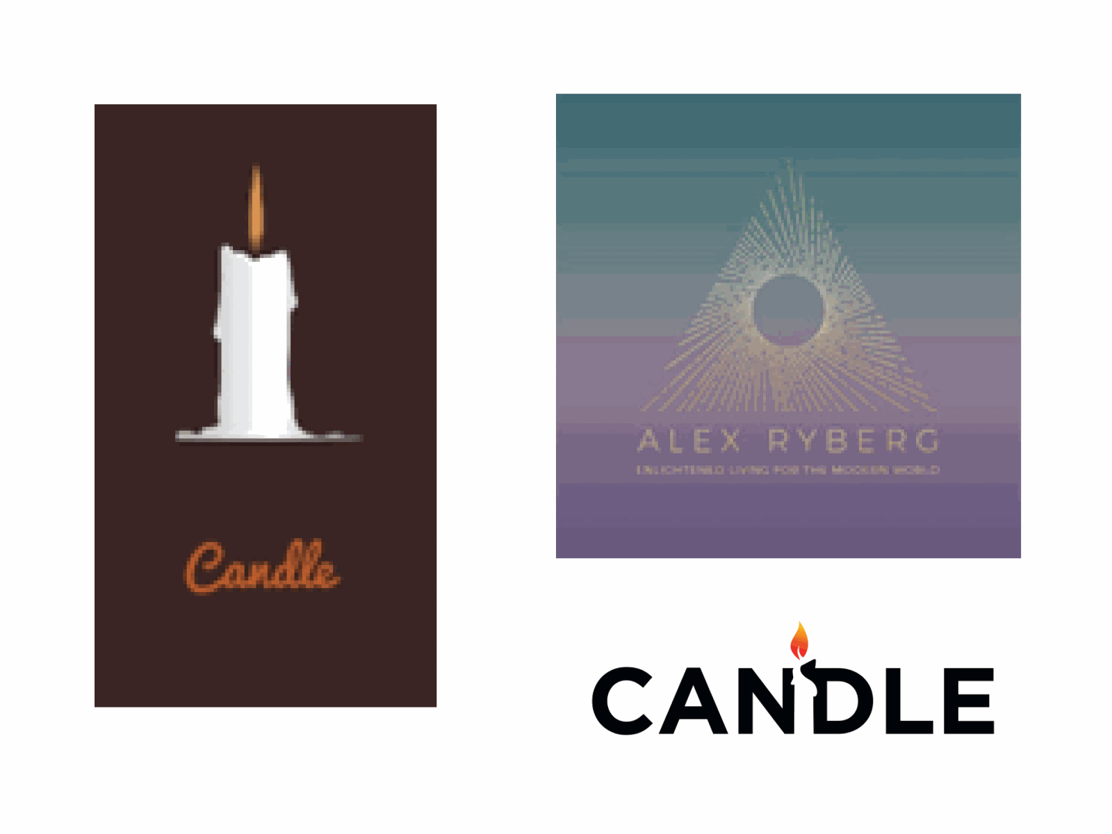
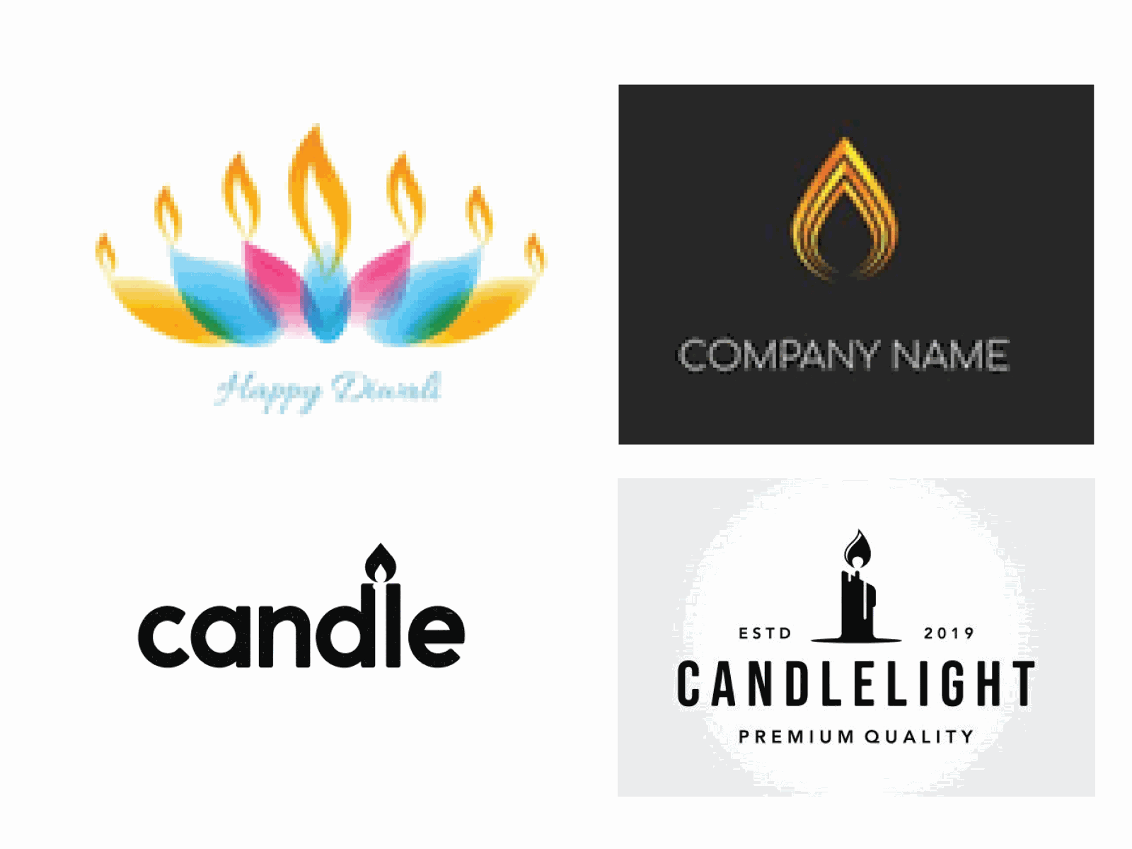
It’s a great idea to explore other logo and branding designs so you can get a feel for what you like and don’t like. An example is if you were wanting a logo for your business East Coast Builder you may search “Builders logo" (your industry) or “East Coast logo” (the name) on sites like images.google.com logopond.com & www.pinterest.com. Save 10 or more samples that you like and don’t like, give us a statement to help understand your preferences (we cannot copy other people's designs, this just help establish the design style and elements that you like). By collecting these images our designers can gain a clearer idea of the design you want.
An example of how the Visual Logo Brief looks like:
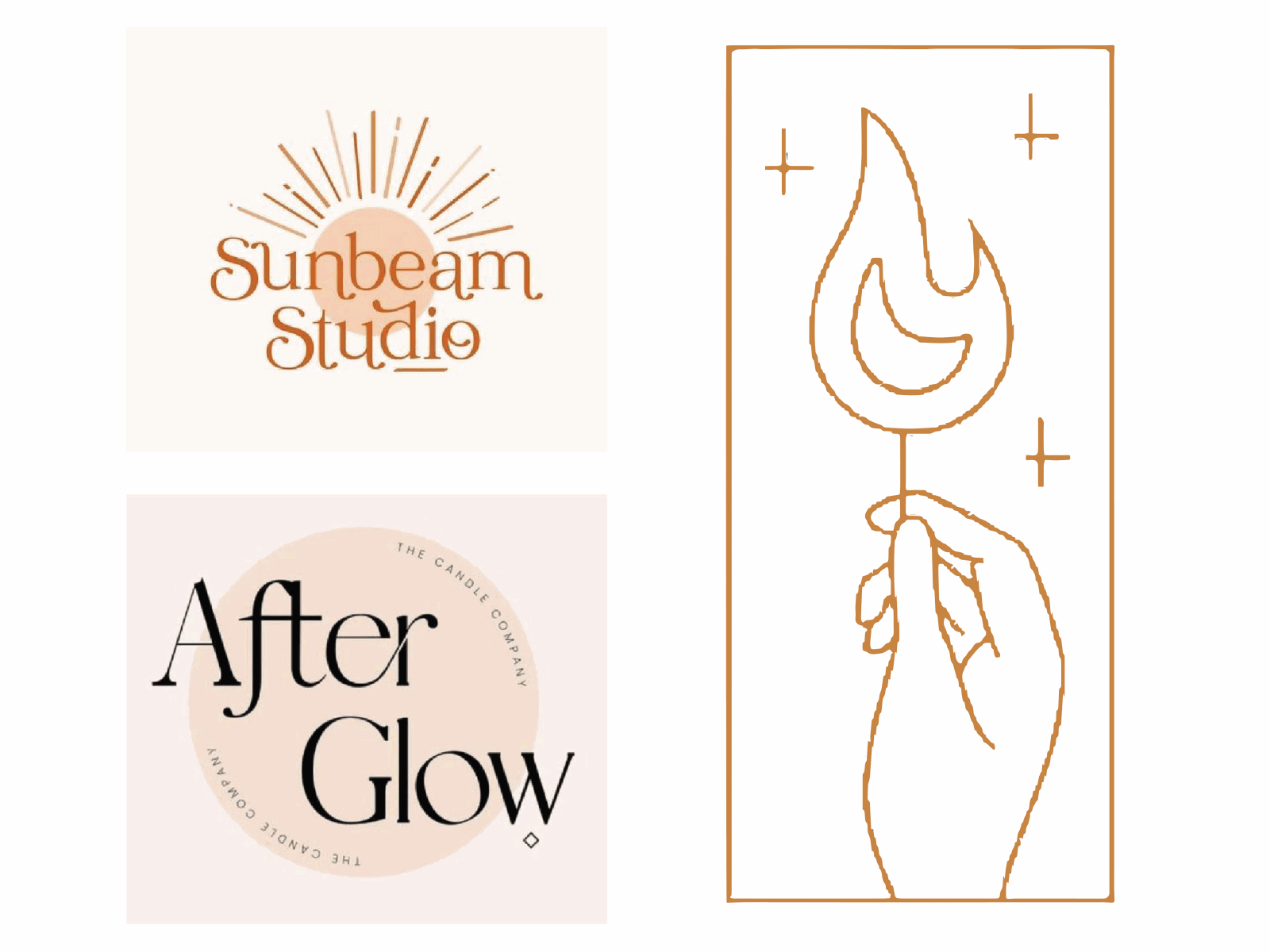
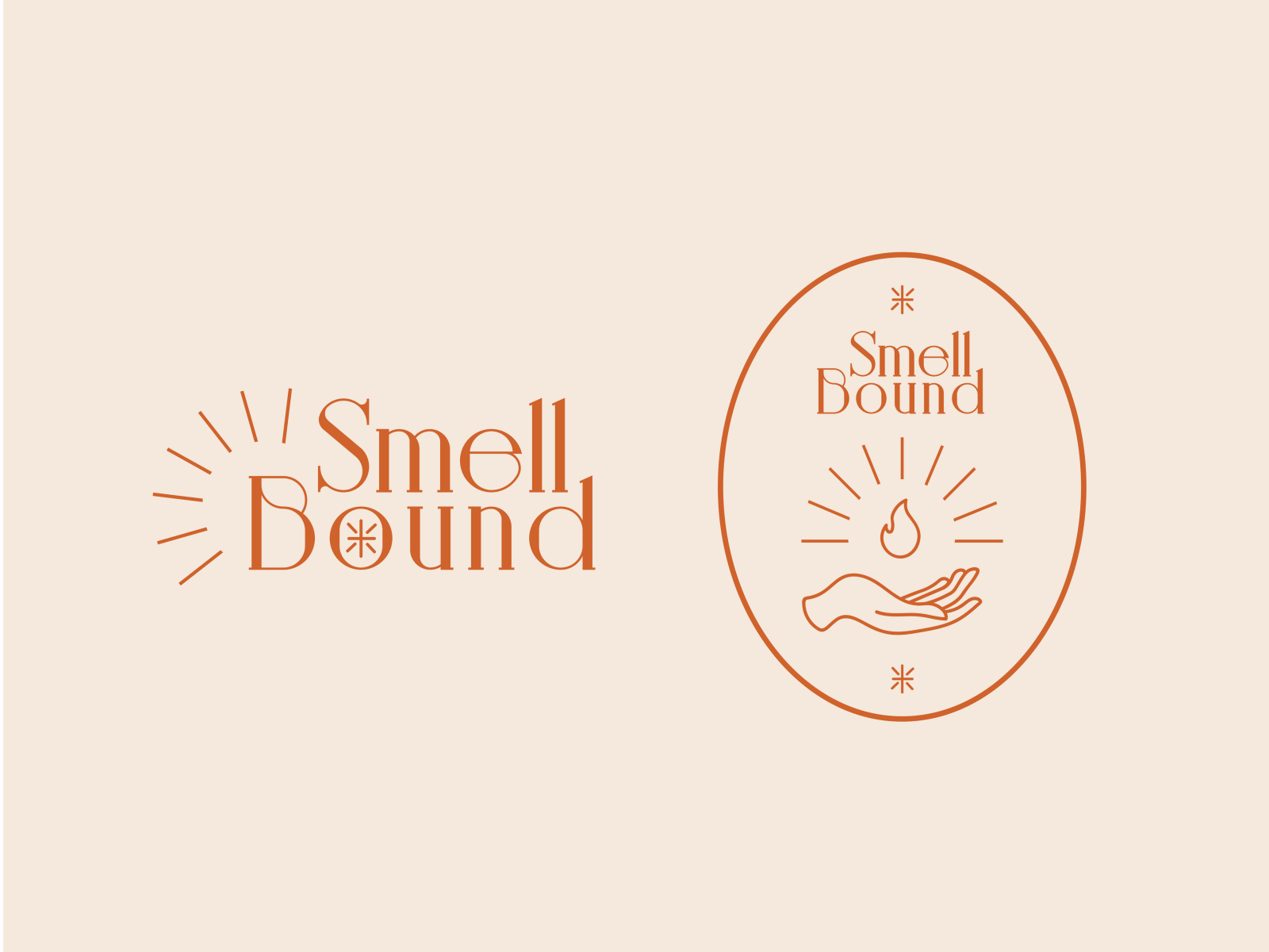
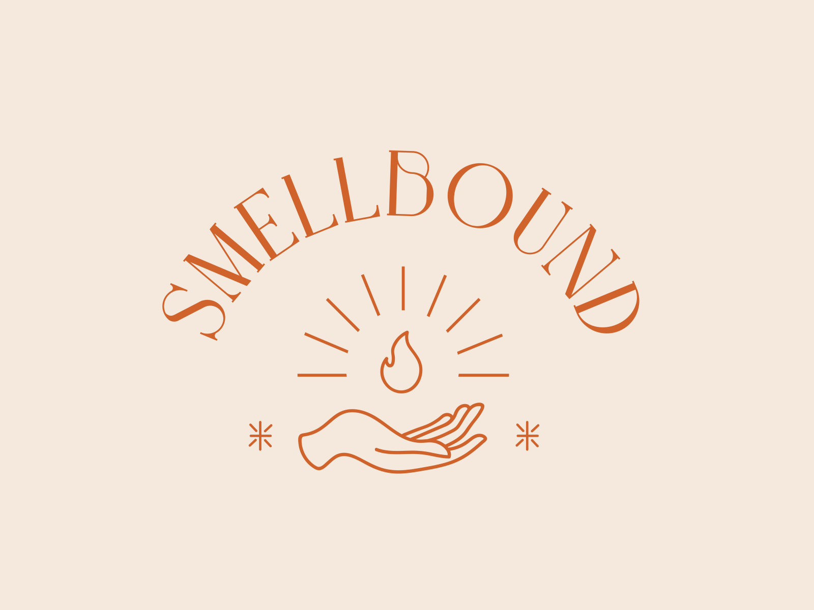
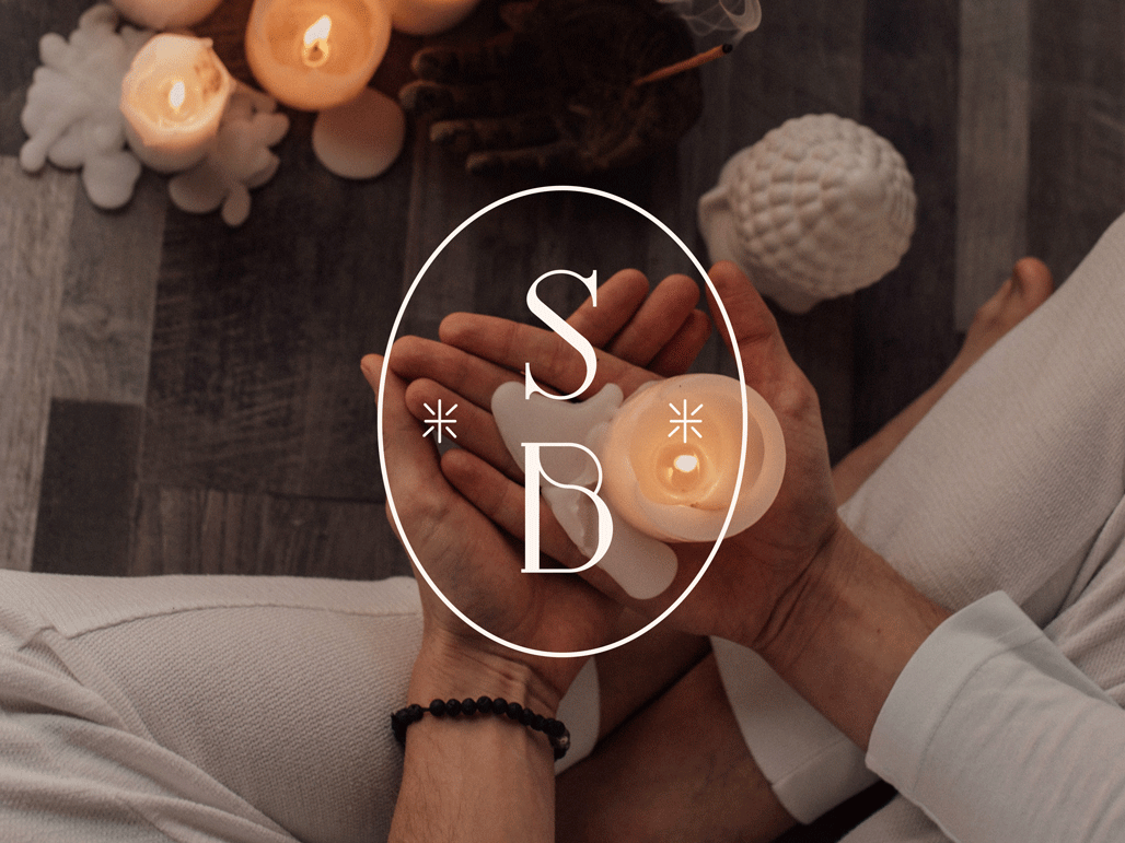
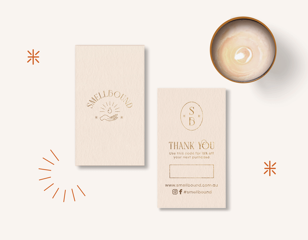
ABOUT THE BRAND: Smellbound is a holistic brand founded by mother and daughter Candy and Pam. We offer a wide range of products from hand poured soy melts, candles and incense sticks to gifts and home decor. We are looking for a fresh look for the brand as well as for the signage of our beautiful shop surrounded by nature in Tambourine Mountain.
LIKES: We love fine line illustration logos that represent what we do, maybe a candle or sun rays. We prefer delicate retro modern fonts. We would like to portray a holistic, gentle and soft feel with a light earthy background colour and a contrasting darker black, orange or brown colour for the logo.
|
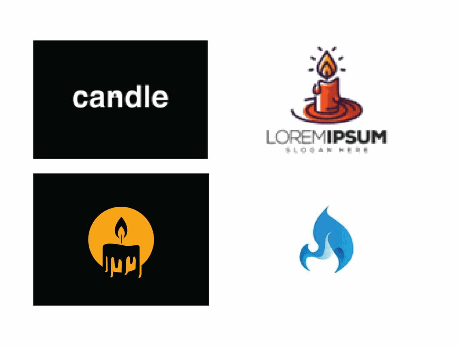
DISLIKES: We don’t like bold or too simple fonts. We’re not big fans of negative space or too simple designs. We also don’t like shaded, multicolour, gradient icons and bright or very dark colours.
|
THE OUTCOME: We combined the holistic spiritual side of the stars and rays with the candle flame through a customised fine line illustration to create a unique logo that represents their values. The wordmark is a unique Serif font type giving the brand a modern, delicate and sophisticated look. Everything comes together to create a delicate, aesthetically pleasing, modern brand.It was a lovely and calming process creating a brand with such magical aesthetic. We loved the result!
|

|
.gif)
Some DO's:
- Keep it simple: A simple logo is often more memorable and recognisable than a complex one.
- Make it versatile: Ensure that your logo can be easily resized and used across a variety of mediums, such as websites, social media, and print materials.
- Consider your target audience: Your logo should appeal to your target audience and accurately represent your brand's values and personality.
- Choose appropriate colours: Colours can evoke emotions and convey meaning, so choose colours that reflect your brand's message and resonate with your target audience.
- Make it unique: Your logo should be distinctive and set your brand apart from competitors.
Some DOn'ts:
- Use clip art or stock images: Your logo should be original and reflect your brand's identity, so avoid using pre-made images.
- Be too trendy: Trends come and go, so avoid designing a logo that will quickly become outdated.
- Use too many colours or fonts: A cluttered logo can be difficult to read and remember, so keep it simple and clean.
- Copy other logos: Copying another brand's logo is unethical and can damage your brand's reputation.
- Neglect the importance of professional design: A well-designed logo can make a significant impact on your brand's success, so invest in the expertise of a professional designer.
In conclusion, the visual brief is an essential tool in the creative process that should not be overlooked. By providing a clear and concise visual representation of your project goals and expectations, you set the stage for success. It ensures that both you and your creative team are on the same page, leading to better collaboration, fewer revisions, and ultimately, a more satisfying end result.


