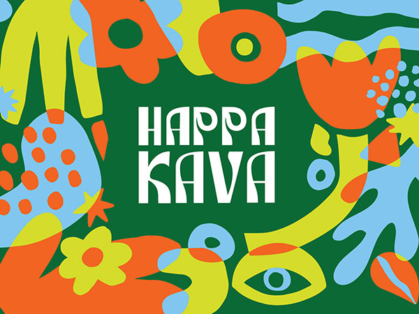
Happa Kava

In a category traditionally defined by muted tones and wellness cues, HAPPA KAVA introduces a bold new direction. Designed as a modern alternative to alcohol, the brand challenges expectations with a vibrant, high-energy identity that speaks directly to a new generation. Our studio was engaged to translate this vision into a distinctive visual language, delivering a Happa Kava Packaging Design that stands apart both culturally and commercially.

The result is a dynamic brand and packaging system that captures attention instantly while communicating a clear message of connection, self-expression, and feel-good experiences. Through colour, form, and personality-driven design, the Happa Kava Packaging Design moves beyond traditional category norms to create a product that feels social, shareable, and relevant.


Brand Vision

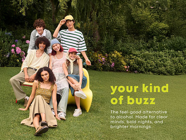
HAPPA KAVA is positioned for a generation redefining how social drinking looks and feels. As a bold alternative to alcohol, the brand centres around connection, wellbeing, and self-expression—offering a feel-good buzz without compromise. Moving away from traditional kava and wellness aesthetics, the vision embraces energy, colour, and cultural relevance, aligning with a Gen Z audience seeking new ways to connect and experience social moments.

Inspired by dopaminergic design, the brand aims to be more than just a product—it becomes part of a lifestyle. The Happa Kava Packaging Design reflects this by creating something expressive, confident, and engaging, designed to be shared, experienced, and proudly recognised.


Package Design, Happa Kava Packaging Design, Beverage Packaging Design Australia, Kava Packaging Design, Gen Z Branding, Vibrant Packaging Design, Alcohol Alternative Branding


Package Design, Happa Kava Packaging Design, Beverage Packaging Design Australia, Kava Packaging Design, Gen Z Branding, Vibrant Packaging Design, Alcohol Alternative Branding


Package Design, Happa Kava Packaging Design, Beverage Packaging Design Australia, Kava Packaging Design, Gen Z Branding, Vibrant Packaging Design, Alcohol Alternative Branding


Package Design, Happa Kava Packaging Design, Beverage Packaging Design Australia, Kava Packaging Design, Gen Z Branding, Vibrant Packaging Design, Alcohol Alternative Branding


Package Design, Happa Kava Packaging Design, Beverage Packaging Design Australia, Kava Packaging Design, Gen Z Branding, Vibrant Packaging Design, Alcohol Alternative Branding


Package Design, Happa Kava Packaging Design, Beverage Packaging Design Australia, Kava Packaging Design, Gen Z Branding, Vibrant Packaging Design, Alcohol Alternative Branding


Package Design, Happa Kava Packaging Design, Beverage Packaging Design Australia, Kava Packaging Design, Gen Z Branding, Vibrant Packaging Design, Alcohol Alternative Branding


Package Design, Happa Kava Packaging Design, Beverage Packaging Design Australia, Kava Packaging Design, Gen Z Branding, Vibrant Packaging Design, Alcohol Alternative Branding


Package Design, Happa Kava Packaging Design, Beverage Packaging Design Australia, Kava Packaging Design, Gen Z Branding, Vibrant Packaging Design, Alcohol Alternative Branding


WHAT WE CREATED

To bring the vision to life, we developed a distinctive brand identity anchored in a custom HAPPA KAVA logotype and a bold visual direction. The typography draws from groovy, retro-inspired forms, reimagined with a modern edge. Each letter was carefully customised, incorporating subtle organic curves inspired by the kava plant—avoiding literal or expected representations. Minimal symbolic elements, such as the dot referencing the ceremonial kava bowl, were integrated through negative space to maintain a clean and contemporary feel.

The Happa Kava Packaging Design extends this identity into a strong on-shelf presence. Moving away from the typical beige wellness aesthetic, the packaging embraces vibrant colour and playful energy to immediately capture attention. Organic, abstract patterns were introduced to create movement and personality, reinforcing the brand’s expressive and feel-good nature. Together, the identity and packaging position HAPPA KAVA as a disruptive, modern brand that confidently stands out both in-store and across digital platforms.


I worked with Gold Coast Graphic Design to help build our full brand vibe plus packaging/label designs and the whole team was great! Ju our Graphic Designer helped us bring our ideas to life and we are very happy! We've had lots of compliments and enquiries about who did our packaging!
Regards Vanessa Anghileri, Chef Frankies