As the market evolves, colour choices have become central to brand identity—One Colour packaging design and branding remains a go-to for impact and trust.CALL TO GET STARTED |
|
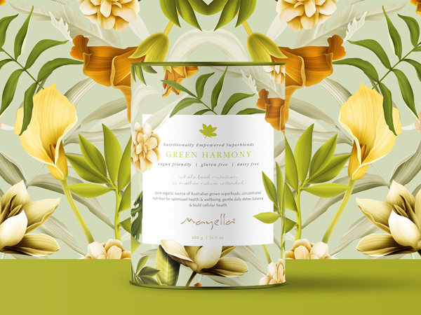
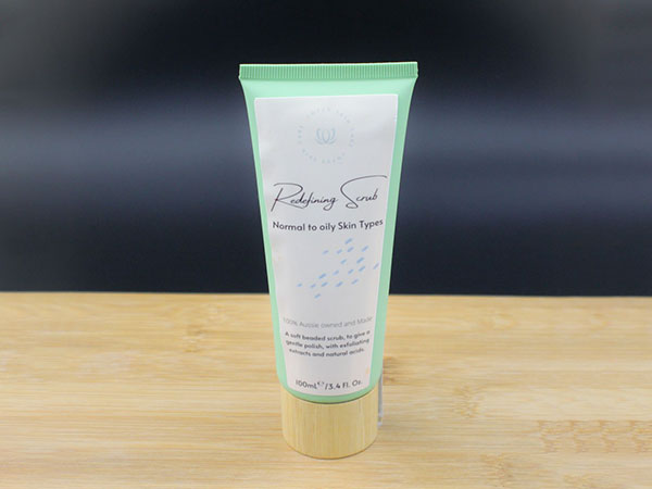
Bringing a product to life marks a major achievement, but how it’s packaged can determine its shelf success. One Colour packaging design and branding doesn’t just stand out—it builds a strong emotional bridge with consumers, setting a tone of calm, quality, and credibility. Colour connects quickly with the brain, influencing decisions in an instant. One Colour hues are proven to evoke stability, cleanliness, and reliability—ideal for forging long-term consumer loyalty.
|
WHAT MAKES PRODUCTS FLY OFF THE SHELF? HOW CAN YOU ENSURE A PRODUCT’S SUCCESS?
|
.png)
.png)
.png)
.png)
 |
COLOUR PRINTING – how does it work?Achieving exceptional packaging results requires understanding how colour is produced during print. Different printing methods—such as CMYK digital, offset, or flexographic—translate colour in distinct ways, each suited to different volumes and substrates. CMYK blends the four base inks to create a broad spectrum of shades, making it ideal for full colour imagery and small to medium print runs. Pantone is a standardised colour matching system used globally to ensure colour consistency in printing and design. It is like a bucket of paint. While Pantone provides superior brand control, it is wise to explore how your colour convert into CMYK too. |
PRODUCT RANGEs – what to think about when planning ONE COLOUR packaging design and brandingWhen choosing colours for your product packaging, it’s smart to think about where your business might go in the future. What happens when the range expands or new variants are introduced? A limited or un-strategic colour palette can quickly become restrictive, making it harder to differentiate new products down the line. flexibility and give you the breathing room for an evolving product range. Some aspects to explore would be how many ranges will you have and how many products in each. Are they differentiated through colour/imagery/shape and size. So what colours will work with one colour packaging design and branding? |
|
3164+ Brands supported


|
|
|
|
|
|
.jpg)
|
|
|
|
|
|
.png)


REBRANDing – what role does colour play?
When packaging feels a little tired it doesn’t always mean a complete overhaul is necessary. A refreshed brand can breathe new life into your product, drawing in new customers in while still honouring the loyalty of existing ones. When exploring this avenue colour plays an important role in keeping customer recognition. Shoppers identity and will continue to look for your blue packaging design and branding, that they connected with. So freshin it up and give it a facelift, but keep visual ques. The decision should be guided by clear strategy. An experienced designer will assess your situation and offer tailored advice to help you reach your brand goals. |
Before and after – See more makeovers
|
|
|
|
|
.jpg)
|
"One Colour packaging design and branding gave our range the bold presence we were missing. The team’s ability to connect colour theory with market expectations was outstanding. From briefing to final delivery, their process was efficient and well thought out. The refreshed design dramatically improved engagement, visibility, and sales performance. We couldn’t be happier with the results." |
|
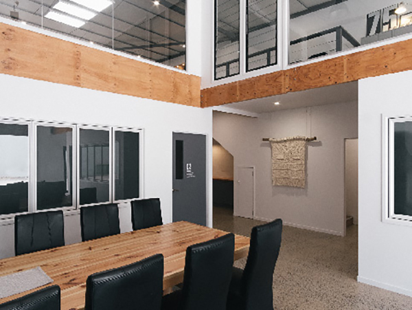
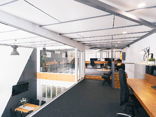
BENEFIT FROM A TRUE COLLABORATION AND 20+ YEARS EXPERIENCE.At Graphic Design Australia, we bring a shared passion for colour theory and one colour packaging design and branding to every project. We work closely with each client to uncover their product’s unique voice and apply colour in ways that elevate both shelf appeal and emotional impact. We believe in collaboration from start to finish, guiding you through decisions that influence recognition, perception, and purchase. Whether launching a new range or refreshing an existing one, our designs do more than look good—they build brand stories that customers connect with. |
.jpg)
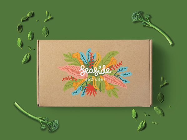
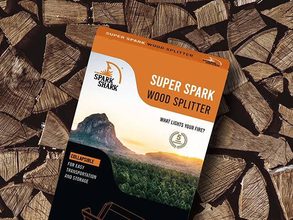
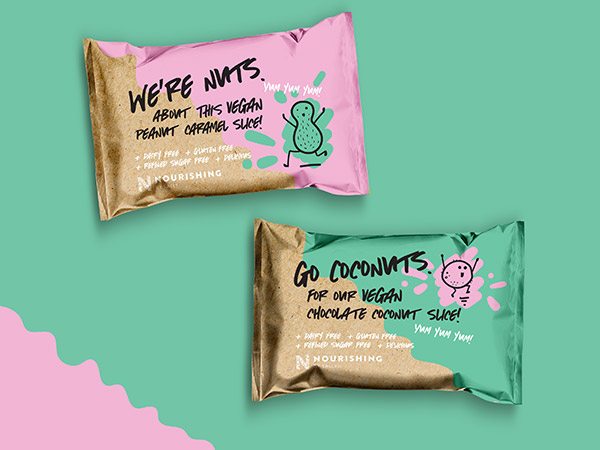
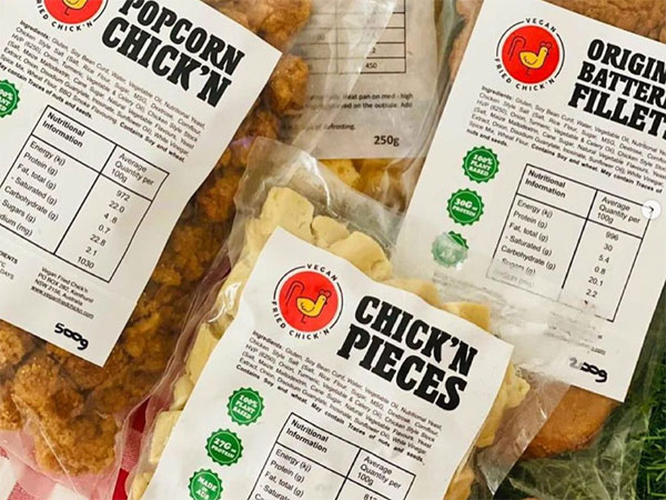
ONE COLOUR packaging design and branding inspiration
|
Contact 


Call 0756 018 971
4/30 Fremantle St Burleigh Heads QLD.
Gold Coast, Brisbane, Melbourne, Sydney Packaging Designers. Food Packaging, Product Branding, Recycle and Eco-friendly Australian Packaging Designers