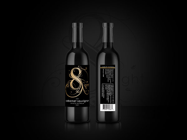
As consumer preferences shift, colour becomes a strategic asset—shaping perception, stirring emotion, and guiding buyer decisions with Gold packaging design and branding.CALL TO GET STARTED |
|
Launching a product takes time, planning, and dedication—but packaging is what customers see first. Gold packaging design and branding does more than visually appeal; it projects trustworthiness, evokes calm, and conveys quality. Colour impressions are formed in under a second, long before a word is read. That’s why gold—linked to dependability, professionalism, and purity—is a strong contender in the branding space. When used well, it builds emotional rapport and sets the tone for how your product is perceived.
|

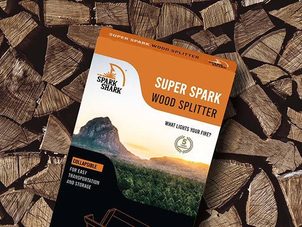
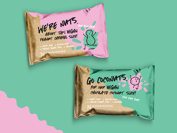
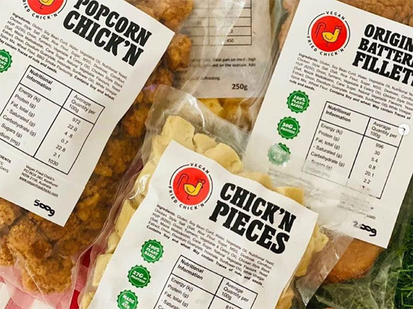
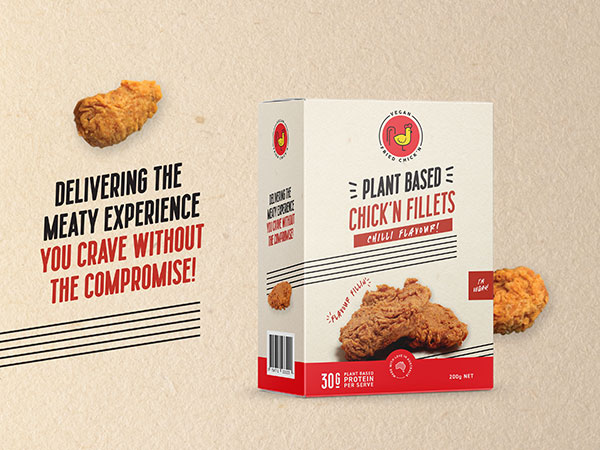
WHAT MAKES PRODUCTS FLY OFF THE SHELF? HOW CAN YOU ENSURE A PRODUCT’S SUCCESS?
|
.png)
.png)
.png)
.png)
 |
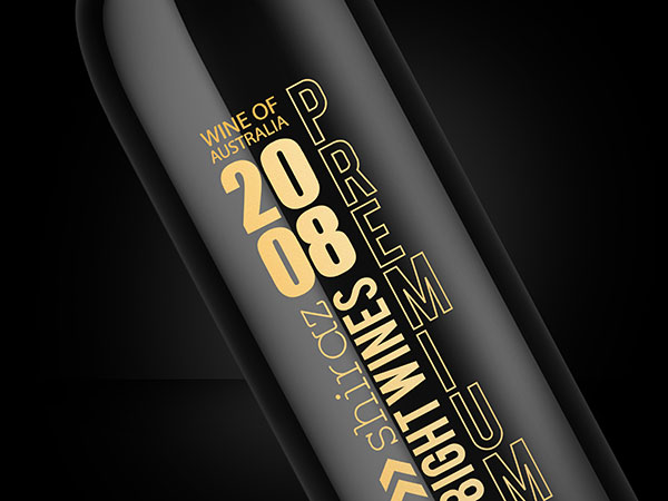
COLOUR PRINTING – how does it work?Achieving exceptional packaging results requires understanding how colour is interpreted through different print technologies. Methods such as digital CMYK, offset, and flexographic printing each have unique behaviours—tailored to varying quantities and surface types. CMYK (Cyan, Magenta, Yellow, and Key/Black) is a subtractive process ideal for photographic and full-colour imagery, especially effective in small to medium runs due to its versatility and affordability. Pantone is a globally recognised colour matching system offering unrivalled colour accuracy and brand uniformity. Think of it as premixed ink with absolute colour fidelity. While Pantone ensures exact colour targeting—especially for logos and flat hues—it’s critical to test how those colours translate when converted to CMYK for broader production use. |
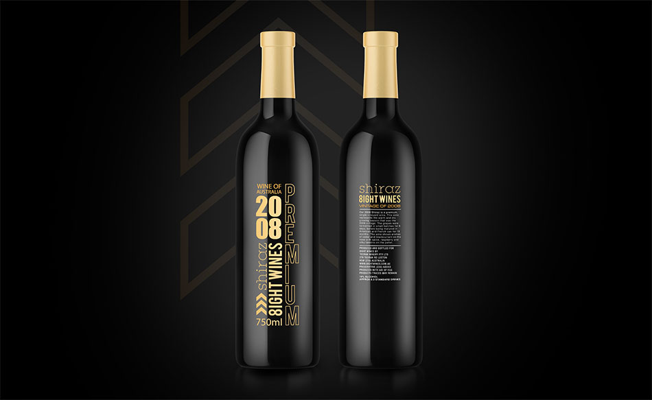
PRODUCT RANGEs – what to think about when planning Gold packaging design and brandingWhen selecting colours for product packaging, it’s essential to plan with future scalability in mind. Consider the impact of product line expansion or the introduction of new variants. An unstructured or overly narrow palette can quickly hinder flexibility, creating visual confusion or limiting differentiation across SKUs. A future-proof palette allows room to grow while maintaining a unified brand presence. A strategic approach involves reviewing how many product ranges exist, how many SKUs will follow, and what will visually distinguish them—be it colour, imagery, shape, or size. So what colour choices will complement gold packaging design and branding while allowing visual clarity across an expanding range? |
|
3164+ Brands supported


|
|
|
|
|
|
.jpg)
|
|
|
|
|
|
.png)


REBRANDing – what role does colour play?
When packaging starts to feel outdated, it doesn’t always demand a complete overhaul. A thoughtful refresh can modernise the brand, appeal to new demographics, and still honour existing customer loyalty. Colour is central to maintaining familiarity—buyers instinctively recognise and are drawn to the gold packaging design and branding they already associate with trust. Adjusting colour application while preserving brand identifiers helps retain recognition. Any refresh or rebrand should be informed by a strategic lens. A skilled designer will evaluate the current brand identity and suggest a bespoke update that aligns with long-term marketing and business objectives. |
Before and after – See more makeovers
|
|
|
|
|
.jpg)
“Gold packaging design and branding gave our products the edge they needed.”
“The team’s understanding of colour psychology and design trends was second to none. From concept to completion, the process was smooth, professional, and highly collaborative. The new gold packaging design and branding not only elevated our brand presence but also significantly boosted consumer engagement and sales. Feedback has been overwhelmingly positive, and we’re confident our investment in strategic colour choices has set the stage for long-term growth and recognition.” |
|
BENEFIT FROM A TRUE COLLABORATION AND 20+ YEARS EXPERIENCE.Here at Graphic Design Australia, our team has a genuine passion for gold packaging design and branding and colour strategy. Our team collaborates closely with you to uncover what makes your brand unique, then translates that into a purposeful colour approach that sets your product apart. Want to be part of the creative journey? You’re invited into every step of the process, where we explore how colour influences emotion, shelf impact, and customer connection. Whether you're launching a single handmade product or managing a large range, we craft packaging designs with colours that not only look beautiful but work hard to tell your brand story and attract attention. |


.jpg)

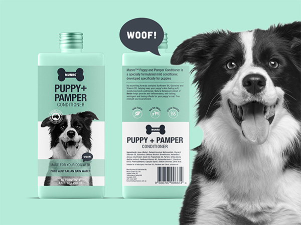
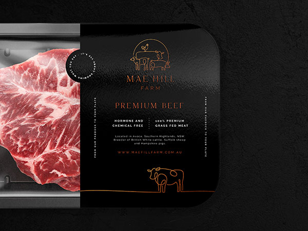
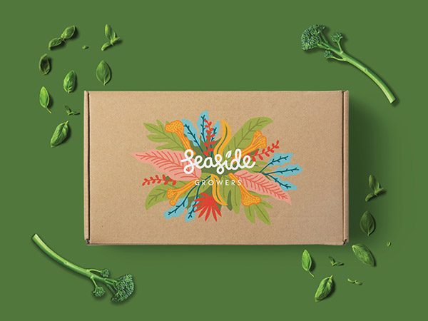
GOLD packaging design and branding inspiration
|
Contact 


Call 0756 018 971
4/30 Fremantle St Burleigh Heads QLD.
Gold Coast, Brisbane, Melbourne, Sydney Packaging Designers. Food Packaging, Product Branding, Recycle and Eco-friendly Australian Packaging Designers