As consumer preferences shift, colour becomes a strategic asset—shaping perception, stirring emotion, and guiding buyer decisions with Turquoise packaging design and branding.CALL TO GET STARTED |
|
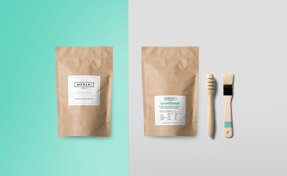
Launching a product takes time, planning, and dedication—but packaging is what customers see first. Turquoise packaging design and branding does more than visually appeal; it projects trustworthiness, evokes calm, and conveys quality. Colour impressions are formed in under a second, long before a word is read. That’s why turquoise—linked to dependability, professionalism, and purity—is a strong contender in the branding space. When used well, it builds emotional rapport and sets the tone for how your product is perceived.
|
WHAT MAKES PRODUCTS FLY OFF THE SHELF? HOW CAN YOU ENSURE A PRODUCT’S SUCCESS?
|
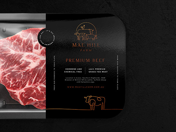
.png)
.png)
.png)
.png)
 |
COLOUR PRINTING – how does it work?Achieving consistent colour output relies on understanding how printing works. Techniques like digital CMYK, offset, or flexographic printing handle ink differently depending on the application. CMYK, blending four ink layers, is great for complex visuals in small runs. Pantone provides solid, consistent colours across substrates. It’s critical to test Pantone-to-CMYK conversions to maintain accuracy. A great example of Turquoise packaging design and branding is PANTONE 15-5519 Turquoise, named Colour of the Year 2010. |
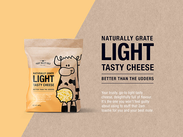
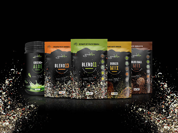
PRODUCT RANGEs – what to think about when planning Turquoise packaging design and brandingWhen planning a colour system for your packaging, it’s important to think ahead—not just about what works now, but how it will scale. As your product line grows, will the colour palette support clear distinction across future SKUs? A rigid or poorly planned system may cause confusion later, while a thoughtful approach ensures adaptability and visual clarity over time. It’s helpful to map out how many ranges you intend to create and the number of items within each. Will each product vary through shade, structure, imagery, or layout? Creating a scalable system early makes expansion easier to manage. The key consideration is: which hues pair effectively with turquoise packaging design and branding? |
 |
3164+ Brands supported


|
|
|
|
|
|
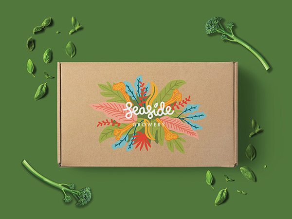
.jpg)
|
|
|
|
|
|
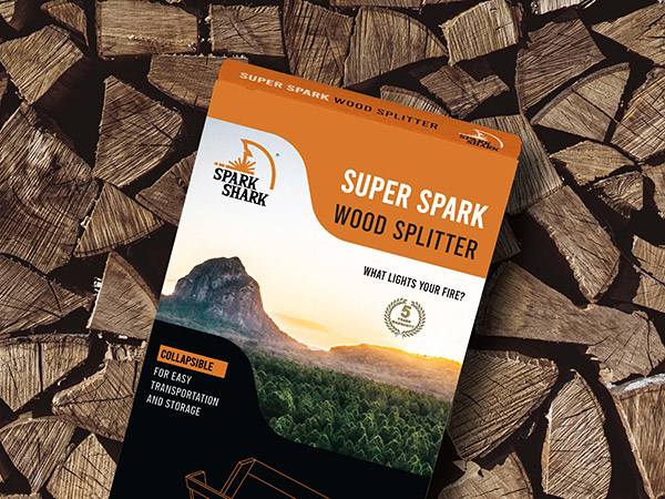
.png)


REBRANDing – what role does colour play?
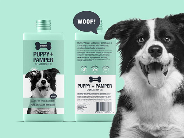
When packaging begins to look dated, a complete rebrand isn’t always the best or only solution. A smart update can reinvigorate shelf presence, appeal to new customers, and still maintain trust among loyal buyers. Colour is vital in this process—consumers rely on and continue to recognise the turquoise packaging design and branding they’re familiar with. The secret is in evolving visual elements without losing core identity. With subtle refinements, packaging can feel fresh and relevant while retaining brand equity. A skilled designer will evaluate your brand and deliver updates that align with your direction and customer expectations. |
Before and after – See more makeovers
|
|
|
|
|
.jpg)
|
"Turquoise packaging design and branding gave our range the bold presence we were missing. The team’s ability to connect colour theory with market expectations was outstanding. From briefing to final delivery, their process was efficient and well thought out. The refreshed design dramatically improved engagement, visibility, and sales performance. We couldn’t be happier with the results." |
|
BENEFIT FROM A TRUE COLLABORATION AND 20+ YEARS EXPERIENCE.At Graphic Design Australia, we’re passionate about creating packaging that tells a story—and colour is a powerful part of that. Our expertise in turquoise packaging design and branding helps brands connect on an emotional and visual level. From concept to print-ready design, our collaborative process ensures your product looks great and performs even better. Whether you’re launching something new or refreshing an old favourite, we craft packaging that resonates with your audience and grows with your business. |
A passionate team that loves
|
|
|
|
|
|
|
|
|
.jpg)

Turquoise packaging design and branding inspiration
|
Contact 


Call 0756 018 971
4/30 Fremantle St Burleigh Heads QLD.
Gold Coast, Brisbane, Melbourne, Sydney Packaging Designers. Food Packaging, Product Branding, Recycle and Eco-friendly Australian Packaging Designers