As trends shift, colour becomes a powerful tool—evoking emotion, shaping perception, and influencing buying decisions through Orange packaging design and branding.CALL TO GET STARTED |
|
Launching a new product is a significant milestone, often built on extensive research, refinement, and strategic decision-making. However, regardless of product quality, visual presentation—particularly colour—can determine how a product is perceived. Orange packaging design and branding goes beyond visual appeal; it shapes emotional response, communicates credibility, and establishes trust within moments of first contact. Colour psychology plays a crucial role in influencing consumer behaviour—setting mood, reinforcing brand values, and triggering emotional reactions almost instantly.
|
WHAT MAKES PRODUCTS FLY OFF THE SHELF? HOW CAN YOU ENSURE A PRODUCT’S SUCCESS?
|
.png)
.png)
.png)
.png)
 |
COLOUR PRINTING – how does it work?Exceptional packaging outcomes rely on understanding how colour is reproduced in print. Different methods—such as CMYK digital, offset, or flexographic printing—render colour differently, each suited to specific volumes and materials. CMYK combines four base inks to create a wide colour range, making it ideal for detailed imagery and small to medium print runs. Pantone is a globally recognised colour-matching system that ensures consistency across print applications. Think of it as a bucket of paint. While Pantone offers superior colour control, it’s important to also understand how those colours convert into CMYK. Memorable Orange packaging design and branding pantone: he Pantone Color of the Year 2024 was PANTONE 13-1023 'Peach Fuzz', a gentle, nurturing, and warm shade described as a soft, velvety mix of pink and orange. |
PRODUCT RANGEs – what to think about when planning Orange packaging design and brandingWhen selecting colours for packaging, it’s important to consider future growth. What happens when new products or variants are added? An unplanned or overly limited colour palette can become restrictive, making it difficult to differentiate products over time. Strategic colour planning allows flexibility and provides breathing room for an expanding range. Key considerations include the number of ranges, products within each range, and how differentiation is achieved—through colour, imagery, size, or format. So which colours will work best alongside orange packaging design and branding? |
 |
3164+ Brands supported


|
|
|
|
|
|
.jpg)
|
|
|
|
|
|
.png)


REBRANDing – what role does colour play?
When packaging begins to feel outdated, it doesn’t always require a full redesign. A considered refresh can reinvigorate a brand, attract new customers, and still respect existing loyalty. Colour plays a vital role in maintaining recognition—shoppers identify and continue to seek the orange packaging design and branding they already trust. Refreshing colour usage while preserving key visual cues ensures continuity. Any rebranding decision should be guided by strategy. An experienced designer will assess your brand and recommend tailored solutions aligned with your goals. |
Before and after – See more makeovers
|
|
|
|
|
.jpg)
“Orange packaging design and branding gave our products the edge they needed.”
|
.jpg) |
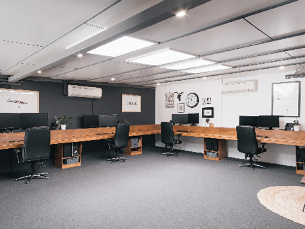
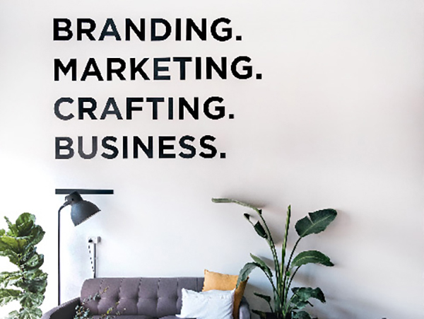
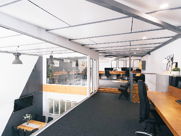
BENEFIT FROM A TRUE COLLABORATION AND 20+ YEARS EXPERIENCE.At Graphic Design Australia, we bring genuine passion and expertise to orange packaging design and branding and colour strategy. Our collaborative approach allows us to uncover what makes your brand unique and translate that into a purposeful colour system that sets your product apart. You’re invited into every stage of the creative journey, where we explore how colour influences emotion, shelf presence, and customer connection. Whether launching a single handmade product or managing a large-scale range, we design packaging that not only looks beautiful—but works hard to tell your brand story and capture attention. |
A passionate team that loves
|
|
|
|
|
|
|
|
|
.jpg)
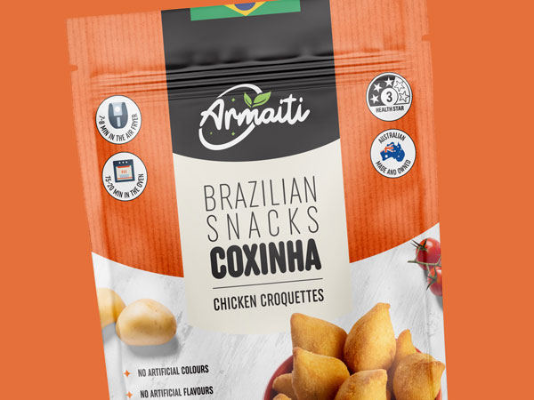
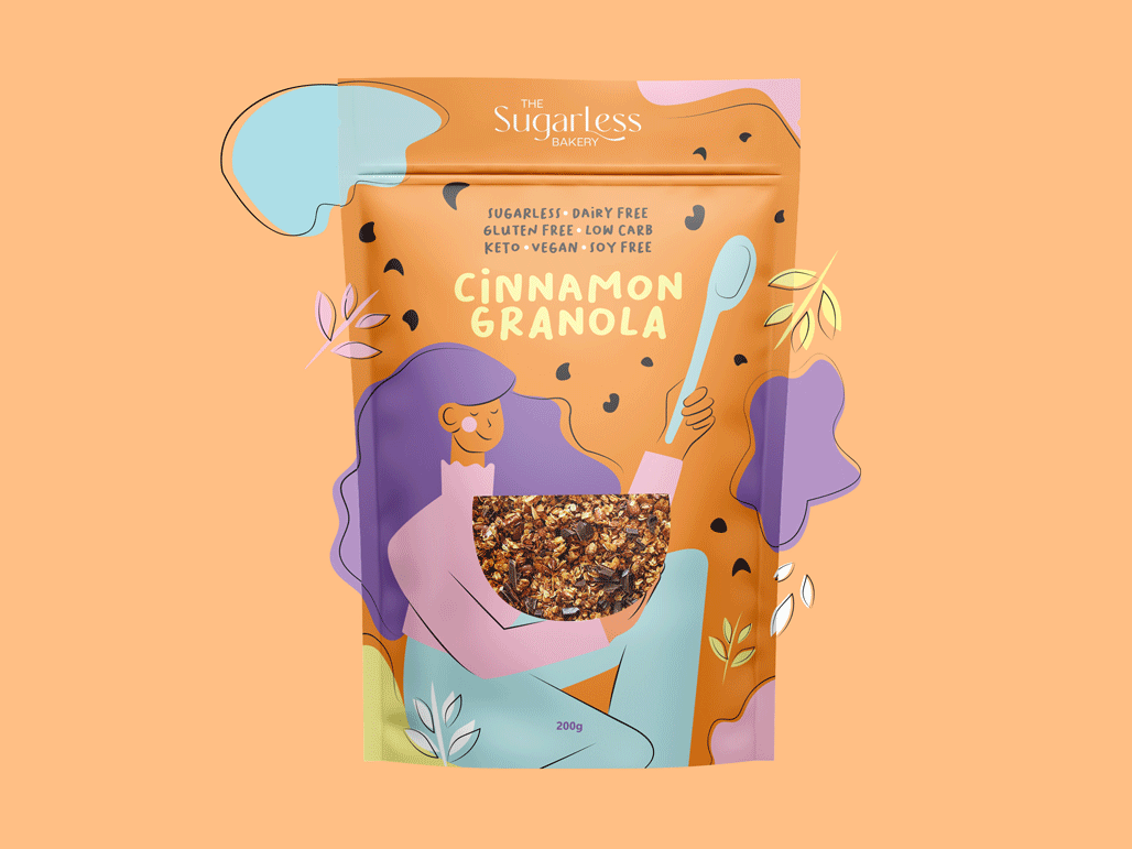
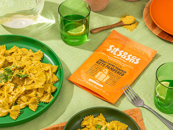
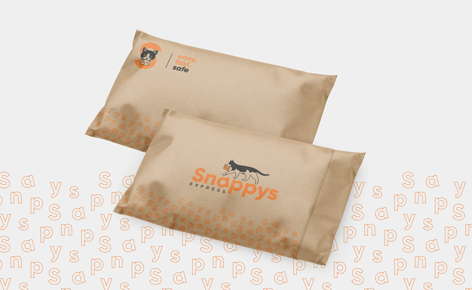
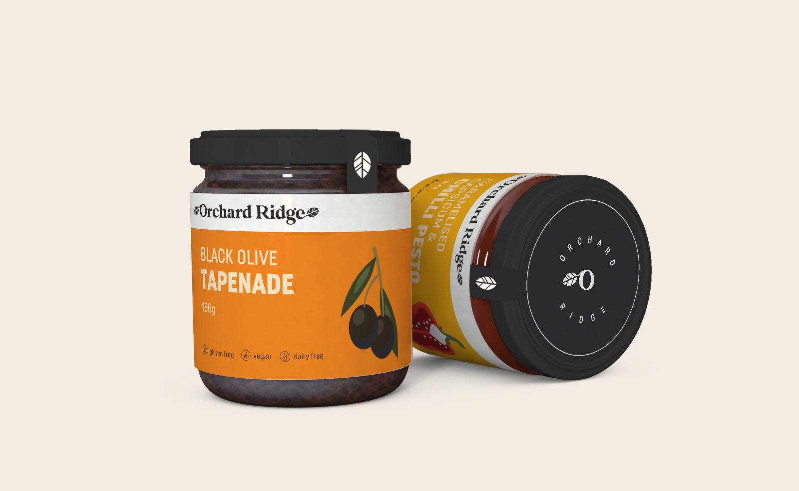
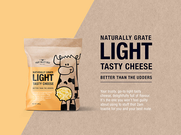
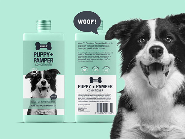
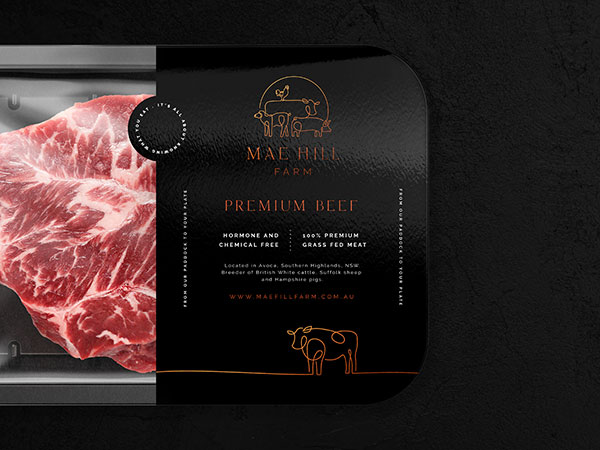
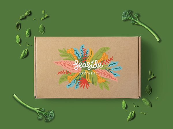
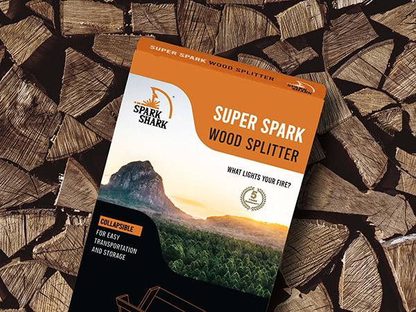
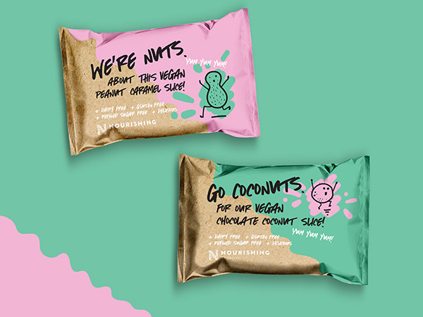
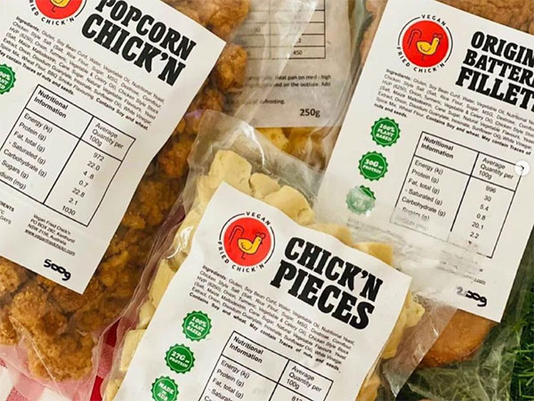
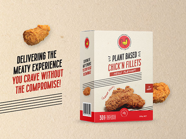
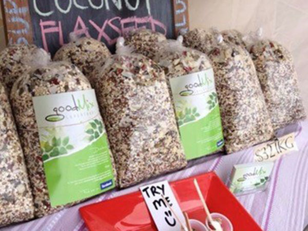
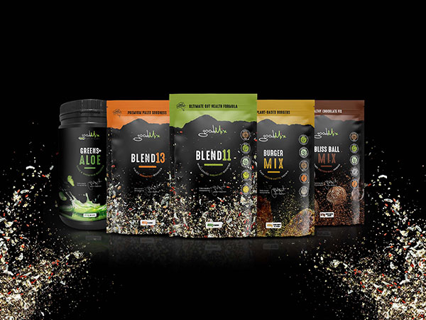
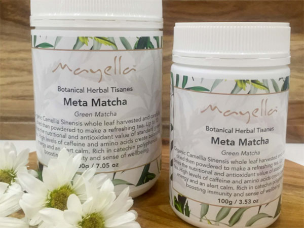
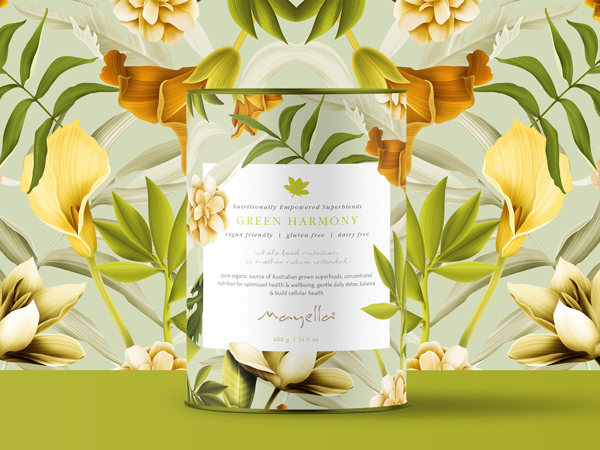
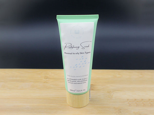
ORANGE packaging design and branding inspiration
|
Contact 


Call 0756 018 971
4/30 Fremantle St Burleigh Heads QLD.
Gold Coast, Brisbane, Melbourne, Sydney Packaging Designers. Food Packaging, Product Branding, Recycle and Eco-friendly Australian Packaging Designers