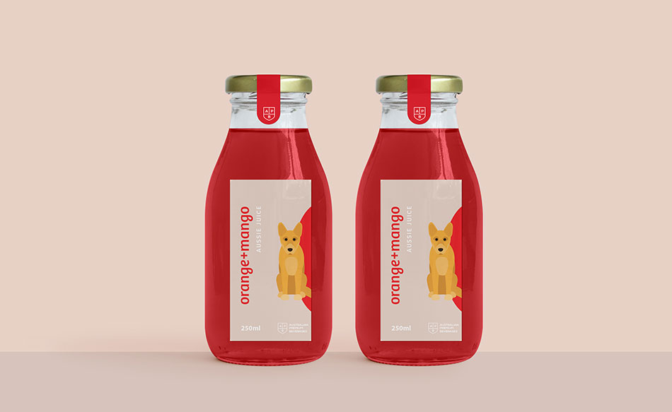
As trends shift, colour becomes a powerful tool—evoking emotion, shaping perception, and influencing buying decisions through Red packaging design and branding.CALL TO GET STARTED |
|
Launching a new product is a significant milestone, often built on extensive research, refinement, and strategic decision-making. However, regardless of product quality, visual presentation—particularly colour—can determine how a product is perceived. Red packaging design and branding goes beyond visual appeal; it shapes emotional response, communicates credibility, and establishes trust within moments of first contact.
|
WHAT MAKES PRODUCTS FLY OFF THE SHELF? HOW CAN YOU ENSURE A PRODUCT’S SUCCESS?
|
.png)
.png)
.png)
.png)
 |
COLOUR PRINTING – how does it work?Consistency in packaging starts with knowing how colours are reproduced. Whether using CMYK digital, offset, or flexographic printing, each method handles ink and materials differently. CMYK processes layer four colours to build rich, varied tones—great for high-detail designs in smaller volumes. Pantone systems offer consistent, pre-mixed hues with exact repeatability across materials and printers. While Pantone is ideal for precise colour branding, always assess how chosen hues convert to CMYK. Memorable Red facts: The colour Red is found in 148 out of 196 national flags |
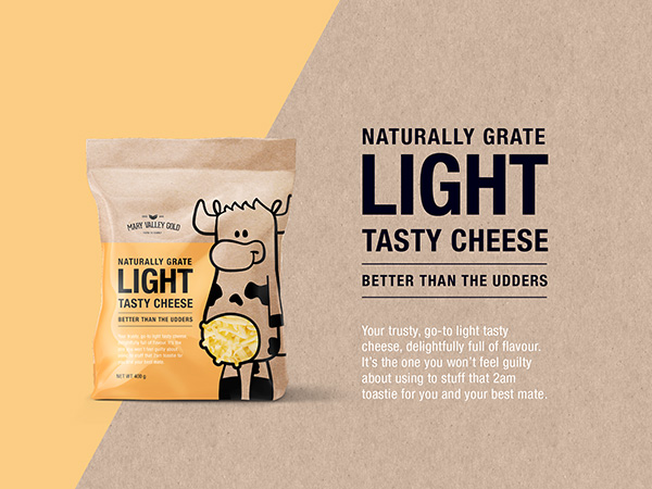
PRODUCT RANGEs – what to think about when planning RED packaging design and brandingWhen developing your packaging colour strategy, it’s essential to look beyond the present and think about long-term flexibility. How will the design adapt as your product range grows? A tight or unplanned palette may limit expansion and create challenges in distinguishing between SKUs later. Building flexibility now allows greater freedom for future variants and range development. It’s worth considering how many collections you plan to launch and the number of items in each. Will visual differences come through in colour, shape, imagery, or format? Establishing a system early allows smoother growth. The question then becomes: what complementary colours work best with red packaging design and branding? |
 |
3164+ Brands supported


|
|
|
|
|
|
.jpg)
|
|
|
|
|
|
.png)


REBRANDing – what role does colour play?
When packaging starts to feel outdated, it doesn’t always call for a full rebrand. A thoughtful refresh can bring renewed energy to your product, attract new customers, and still respect the loyalty of your existing base. Colour plays a critical role in this process—shoppers recognise and continue to trust the Red packaging design and branding they already know. The key is to retain those familiar visual cues while updating what feels dated. A strategic facelift can modernise your look without losing identity. A professional designer will assess your brand and recommend clear, goal-driven updates tailored to your growth. |
Before and after – See more makeovers
|
|
|
|
|
.jpg)
|
"Red packaging design and branding gave our range the bold presence we were missing. The team’s ability to connect colour theory with market expectations was outstanding. From briefing to final delivery, their process was efficient and well thought out. The refreshed design dramatically improved engagement and sales performance. We couldn’t be happier with the results."
|
 |
BENEFIT FROM A TRUE COLLABORATION AND 20+ YEARS EXPERIENCE.Here at Graphic Design Australia, our team has a genuine passion for red packaging design and branding and colour strategy. Our team collaborates closely with you to uncover what makes your brand unique, then translates that into a purposeful colour approach that sets your product apart. Want to be part of the creative journey? You’re invited into every step of the process, where we explore how colour influences emotion, shelf impact, and customer connection. Whether you're launching a single handmade product or managing a large range, we craft packaging designs with colours that not only look beautiful but work hard to tell your brand story and attract attention. |
A passionate team that loves
|
|
|
|
|
|
|
|
|
.jpg)
RED packaging design and branding inspiration
|
Contact 


Call 0756 018 971
4/30 Fremantle St Burleigh Heads QLD.
Gold Coast, Brisbane, Melbourne, Sydney Packaging Designers. Food Packaging, Product Branding, Recycle and Eco-friendly Australian Packaging Designers