As the market evolves, colour choices have become central to brand identity—
CALL TO GET STARTED |
|
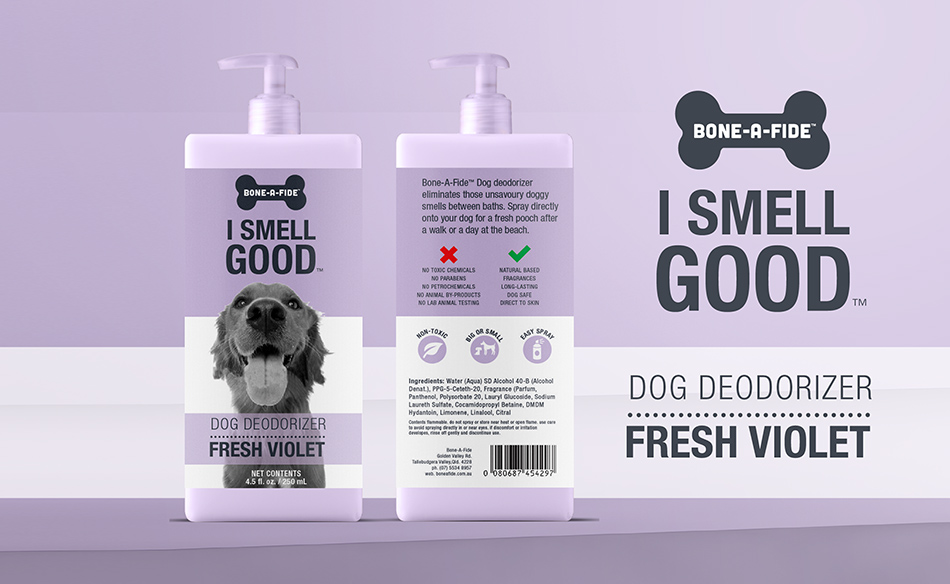
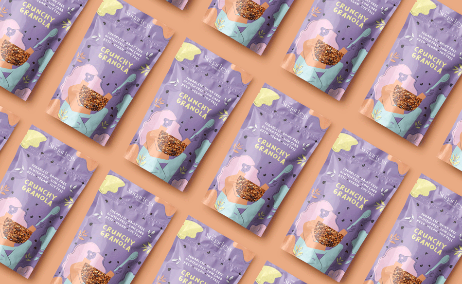
Bringing a product to life marks a major achievement, but how it’s packaged can determine its shelf success. Purple packaging design and branding doesn’t just stand out—it builds a strong emotional bridge with consumers, setting a tone of calm, quality, and credibility. Colour connects quickly with the brain, influencing decisions in an instant. Purple hues are proven to evoke stability, cleanliness, and reliability—ideal for forging long-term consumer loyalty.
|
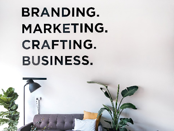
WHAT MAKES PRODUCTS FLY OFF THE SHELF? HOW CAN YOU ENSURE A PRODUCT’S SUCCESS?
|
.png)
.png)
.png)
.png)
 |
COLOUR PRINTING – how does it work?Achieving consistent colour output relies on understanding how printing works. Techniques like digital CMYK, offset, or flexographic printing handle ink differently depending on the application. CMYK, blending four ink layers, is great for complex visuals in small runs. Pantone provides solid, consistent colours across substrates. It’s critical to test Pantone-to-CMYK conversions to maintain accuracy. A great example of Purple packaging design and branding is PANTONE 18-3838 Ultra Violet, a deeply dramatic and thoughtful purple, was named the Pantone Color of the Year for 2018. |
PRODUCT RANGEs – what to think about when planning Purple packaging design and brandingWhen planning a colour system for your packaging, it’s important to think ahead—not just about what works now, but how it will scale. As your product line grows, will the colour palette support clear distinction across future SKUs? A rigid or poorly planned system may cause confusion later, while a thoughtful approach ensures adaptability and visual clarity It’s helpful to map out how many ranges you intend to create and the number of items within each. Will each product vary through shade, structure, imagery, or layout? Creating a scalable system early makes expansion easier to manage. The key consideration is: which hues pair effectively with purple packaging design and branding? |
 |
3164+ Brands supported


|
|
|
|
|
|
.jpg)
|
|
|
|
|
|
.png)


REBRANDing – what role does colour play?
When packaging begins to look dated, a complete rebrand isn’t always the best or only solution. A smart update can reinvigorate shelf presence, appeal to new customers, and still maintain trust among loyal buyers. Colour is vital in this process—consumers rely on and continue to recognise the purple packaging design and branding they’re familiar with. The secret is in evolving visual elements without losing core identity. With subtle refinements, packaging can feel fresh and relevant while retaining brand equity. A skilled designer will evaluate your brand and deliver updates that align with your direction and customer expectations. |
Before and after – See more makeovers
|
|
|
|
|
.jpg)
|
“The team’s understanding of colour psychology and design trends was second to none. From concept to completion, the process was smooth, professional, and highly collaborative. The new Purple packaging design and branding not only elevated our brand presence but also significantly boosted consumer engagement and sales. Feedback has been overwhelmingly positive, and we’re confident our investment in strategic colour choices has set the stage for long-term growth and recognition.” |
 |
BENEFIT FROM A TRUE COLLABORATION AND 20+ YEARS EXPERIENCE.At Graphic Design Australia, we live and breathe colour strategy and purple packaging design and branding. Through collaboration, we uncover your brand’s essence and translate it into packaging that wins attention and tells your story. You’ll be involved from concept to rollout—ensuring the final product reflects your vision. Whether starting with one SKU or launching an entire range, we develop packaging that’s functional, beautiful, and engineered to perform. |
A passionate team that loves
|
|
|
|
|
|
|
|
|
.jpg)
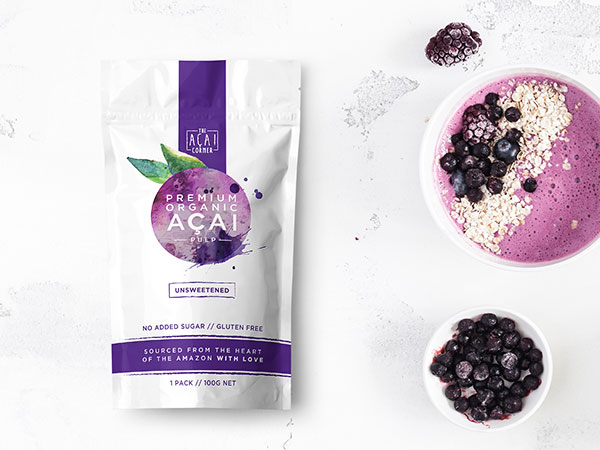
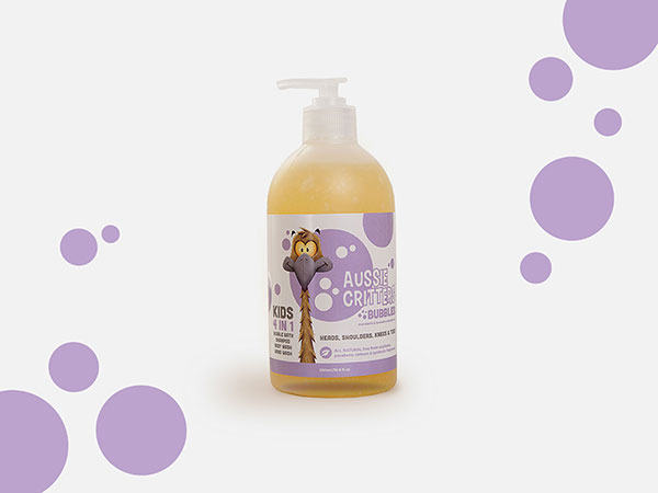
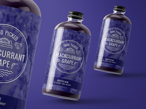
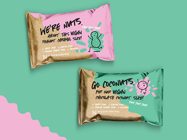
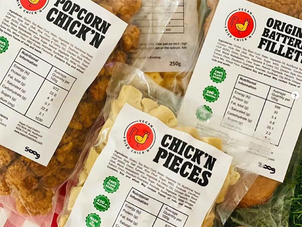
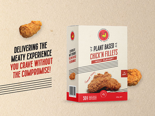
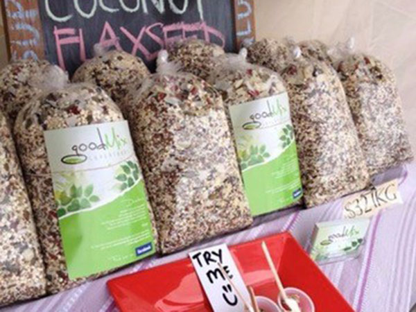
PURPLE packaging design and branding inspiration
|
Contact 


Call 0756 018 971
4/30 Fremantle St Burleigh Heads QLD.
Gold Coast, Brisbane, Melbourne, Sydney Packaging Designers. Food Packaging, Product Branding, Recycle and Eco-friendly Australian Packaging Designers