BRAND VISION
|
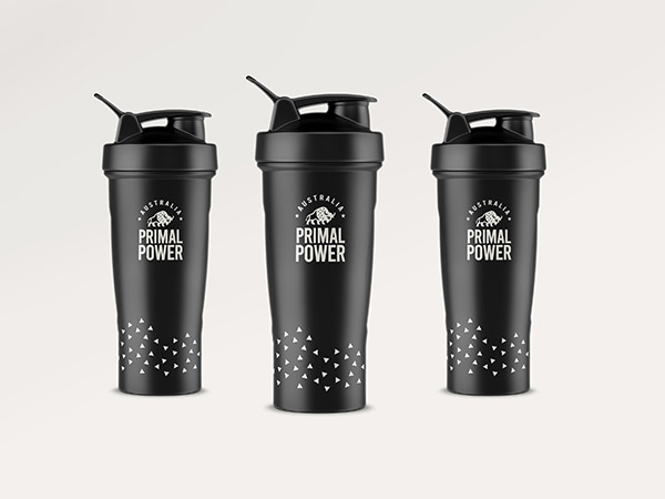
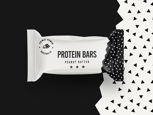
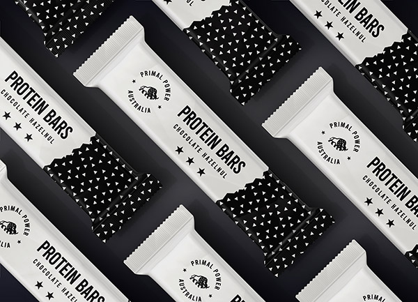
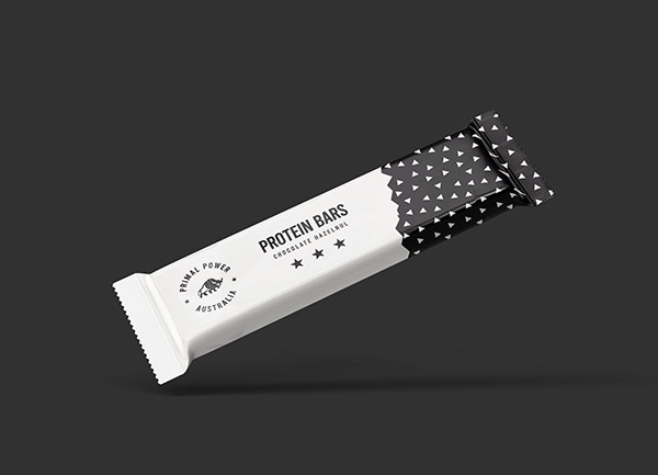
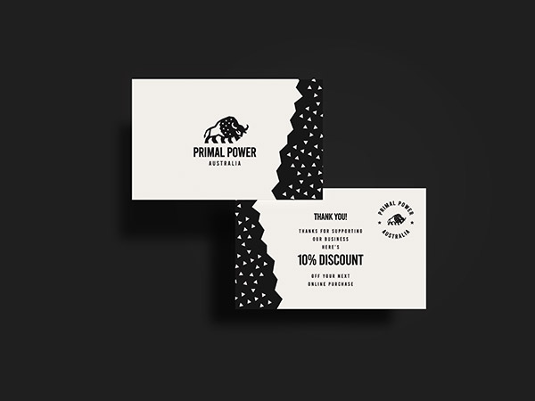
Australia Primal Power is a deliciously satisfying high protein bar that will convince you that it is the best protein bar of all time. This is not only for its taste, but also for how satisfied you feel after eating it. Organic maple syrup sweetens the bars to a healthy balance with only the finest organic ingredients. Calcium, iron, magnesium, potassium, phosphorus, vitamin E, and B vitamins, found in protein bars, help you meet your daily requirements for these micronutrients and Primal Power know all about it and they came to us to create a creative and bold protein bar packaging design.
|