CHOOSING COLOUR
How to Choose Colour for Your Brand
Colour isn’t just decoration — it’s a strategic tool that defines how your brand is perceived, the emotions it inspires, and the way customers respond to it. The colours you choose for your brand will be used across logos, packaging, websites, signage, and marketing — so selecting the right palette from the outset is essential to long-term success. Colour can influence mood, boost recognition, and even drive purchase decisions, making it one of the most impactful elements of visual identity.
Why Brand Colour Matters
Choosing colour for your brand goes far beyond personal preference. Colours evoke emotion, communicate traits (such as trust, energy, or calm), and help customers form quick impressions — often before they read a single word. Research suggests a significant amount of consumer perception is driven by colour alone, making it foundational to both recognition and memorability.
Effective brand colour choices help:
- Communicate personality — different hues convey different qualities
- Build recognition — consistent use reinforces familiarity
- Influence decisions — colour impacts emotions and perception
With careful selection, your brand colour palette becomes a visual shorthand for what your business stands for.
Understand Your Brand First
Before selecting colours, clarify your brand’s core identity:
- What are your values?
- Who is your target audience?
- What emotions do you want to evoke?
Knowing these answers sets the foundation for colour choices that reflect your brand story — not just how you want to feel, but how you want your audience to experience your brand. This customer-centric approach creates a deeper emotional connection.
Learn Basic Colour Psychology
Different colours send different signals. Understanding these associations helps you choose colours that support your brand message rather than contradict it.
|
|
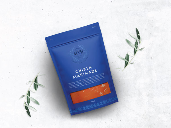
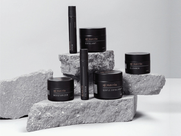
Black: Black branding colour theory focuses on power, sophistication and authority. Black conveys elegance, luxury and timelessness, making it a go-to choice for premium brands. It creates strong contrast, enhances readability, and adds visual impact when paired with other colours. Used strategically, black can evoke exclusivity and confidence, helping brands establish a bold, memorable identity. |
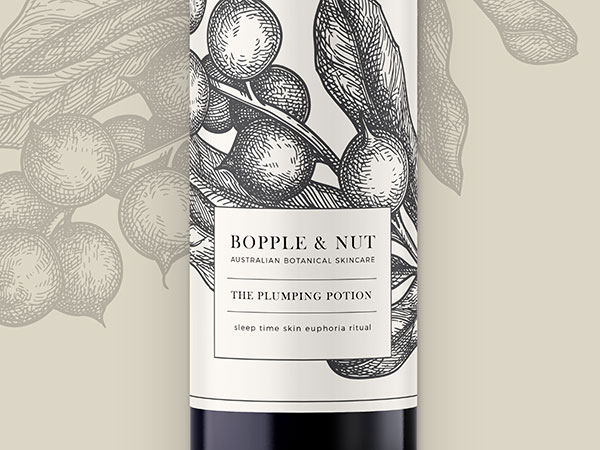
White: White branding colour theory centres on purity, simplicity, and clarity. In packaging and brand design, white often communicates cleanliness, freshness, and efficiency, making it popular in skincare, healthcare, and technology sectors. Its minimalist quality creates space and balance, allowing logos and accent colours to stand out while reinforcing a modern, refined brand identity. |
Beige: Beige branding focuses on calm, warmth, and understated sophistication. As a neutral tone blending soft brown and white, beige communicates stability, approachability, and timeless elegance. In packaging and brand design, it often serves as a refined backdrop that allows other elements to stand out while reinforcing a natural, balanced, and trustworthy brand identity. |

Use a Simple Process to Build Your Palette
Step 1: Start with a base colour
Select a primary hue that reflects your brand’s core personality.
Step 2: Add supporting colours
Choose two or three additional colours that complement your base. These can provide contrast, add depth, or highlight specific elements in your design.
Step 3: Finalise with accent tones
Accent colours are used sparingly — often for calls to action, highlights, or supporting graphics.
4. Think About Versatility and Growth
Your colour palette needs to be more than attractive — it must be flexible. As your brand grows, you’ll apply colour across multiple mediums — from signage and unboxing experiences to social media and advertising. Keeping your palette manageable ensures consistency without confusion later on.
choosing and Using Tone
Colour tones play a significant role in shaping how a brand is perceived. While a base colour carries meaning, the tone — whether light, muted, saturated, or dark — can dramatically shift how that colour feels to an audience.
Lighter tones often create a sense of freshness, openness, and approachability. Soft blues, pale greens, and gentle neutrals feel calming and clean, which is why they are commonly used in wellness, skincare, and lifestyle branding. These tones communicate clarity and ease, helping brands appear accessible and trustworthy.
Darker tones tend to convey strength, sophistication, and authority. Deep blues, rich greens, and charcoal shades often feel more premium and confident, making them popular for finance, luxury products, and professional services.
Importantly, different tones of the same colour can communicate very different feelings. For example, a bright or deep red may signal excitement, urgency, or passion, while a softer or lighter red can feel warm, friendly, or playful. Similarly, a deep navy blue conveys authority and professionalism, whereas a light sky blue feels open, calm, and refreshing.
By carefully selecting tones within a colour palette, brands ensure their visual identity communicates the precise mood they want audiences to experience.
Choosing colour for your brand is a blend of creativity and strategy. When you understand your identity, audience, and emotion goals, you can craft a palette that not only looks great but functions beautifully across markets and media. Your brand colour palette is one of your most valuable assets — treat it with intention and let it reflect the story you want your audience to remember.


